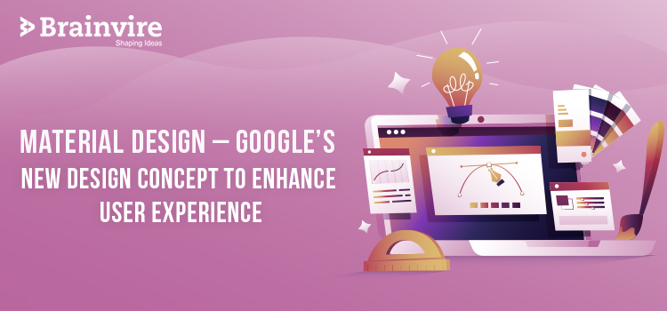
Material Design – Google’s New Design Concept to Enhance User Experience
Design has always been important; be it for websites or applications. It plays an integral part when it comes to attracting customers and enhancing user experience. So, user interface is responsible for the look and feel of websites and apps. In this modern mobile age, businesses want to make their business app look the best, so as to impress the customers. So, new trends keep evolving in design. While Microsoft came up with the concept of Skeuomorphism Design, Apple came up with the best concept ever, Flat Design. However, now is the time for something new and amazing that Google team has come up with, Material Design!
Material design has been in the market for quite some time now and it is inspired by the card based aesthetics. However, when it comes to Android app development, Material design was not mandatory in Android 5, as the apps were working well even without using Material design. However, when it comes to Android 6, it is mandatory to upgrade the app with Material Design. Well, some of you might still not be clear with the concept of Material design, which is completely normal.
So, let us first discuss about what exactly Material design is and where has the craze reached!
Material design was in the middle of Skeuomorphism and Flat design.
Why?
The answer is, Skeuomorphism was highly gaudy and 3D style whether it was for expressing logo or app. Well, during the nineties, such glossy, shining and gaudy nature was common and people used to like it too. However, in the early 2000s, came Flat design, as an answer to the Skeuomorphism! Flat was completely opposite to Skeuomorphism, as it was not at all gaudy and shiny, but flat and matte. There was no more gloss and 3D, in fact, it was completely flattened, with no animation. However, with the designer point of view, neither Skeuomorphism nor Flat was good enough to impress customers. None of the design could win the hearts. However, the war between the Skeuomorphism and Flat design continued for quite a lot of time, when Google design team came up with the solution to the problem, Material Design, which is in the middle of both type of designs.
Material design was not glossy or 3D, it was matte and flat. However, it was not exactly like Flat design, as it had a little of animation too. It had various elements like shadows that can interact with each other. So, if Flat design was shallow, Material design had depth.
We can see the first use of Material design in Google Now in 2015. The UI design of Google Now was card based layout and it employs material metaphors. The three basic design principles of Google’s Material design philosophy are:
1. Material is metaphor: This is inspired from paper and pen and it is still open to imaginations.
2. Bold, graphic, intentional: Typography, space, color, grids, scale and images are the elements that define this interface.
3. Motion provides meaning: User is taken to primary movement creator and transition is smooth.
Card Based Design – Animating the Material Design: When the card based design meets with animation, it makes the concept of Material design. As it is not so gaudy and not so simple too, it is one of the most important designs to be used, and it is going to last for at least a few years to come.
Related Articles
-
 10 Steps To Publish An Android App On Google Play Store
Smartphones have become one of the most go-to gadgets for almost every user in the world. It’s increasing usage has led mobile apps in expose app businesses to a significant
-
Top 5 Considerations While Selecting A Mobile Application Development Company
Mobile application development companies are numerous. It’s particularly a tedious task to locate the right one for your business. Picking just any one (amongst millions) is like gambling. All companies
-
 Accel – Another Investor In Android Keyboard Maker SwiftKey In Its $17.5M Series B!!!
SwiftKey, an alternative Android Keyboard-maker company, has recently added another investor in its upcoming $17.5 million series B. The company is soon going to launch software in more 100 million