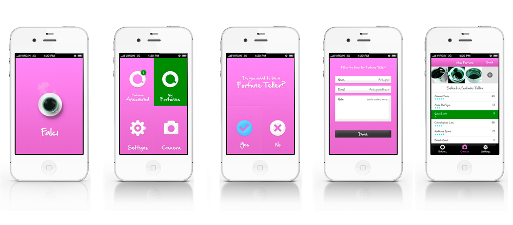
Mobile app design can get messy if you do not follow all the design guidelines. Getting the design right will help you avoid mistakes that can lead to a messy app that does not look right or work right. Let’s get down to the nitty gritties of mobile application design and the general “don’ts” that you should take into account to create an application.
Developing a fully functional app requires discipline and attention to all the nuts and bolts that go into the creation of an interesting and intuitive mobile app.
Here are a list of don’ts:
Don’t Design Wireframes Without a Logic Flow Chart
Before you begin wireframing, make sure that you have a logical flow for user interaction with the application. From simple to complex applications, make sure that you have a reasonable navigation flow ready for the designer. The key application screens should be close to the top of the navigation rather than buried beneath the navigation elements. Do not skip this important step in design.
Don’t Design With Low Resolutions
Screen resolutions of mobile devices are getting better and better. Designing for low resolution has it’s advantages, but such designs may not render well on the mobile devices. You can design for retina, high res, pixel-dense screens and then scale down. It’s always good to start with high resolution images and then scale down. It’s advisable to design with vector graphics rather than bitmaps.
Tapping with index fingers on the mobile screen is how your app is going to be used. Take into account the width of an average finger and then decide the size of the tappable area of your design. Do not pack too many buttons on the screen. It will just mix up the taps and create a mess.
Don’t go overboard with animations
All users are different and will interact with your app in different ways. So, usability testing is a must. Do not avoid this crucial step. Select a few testers and ask feedback.
Mobile apps with all the design elements appropriately included will ensure that you get it right before passing it on to the developers for further processing.
Related Articles
-
Push Notification: The Best Marketing Strategy to Boost Interest, Loyalty, and Conversion
If you have a mobile application, you should be familiar with push notifications. You may know what a push notification is or how it works, but are you effectively utilizing
-
Step By Step Guide To Develop Smart Stock Trading App
The investing world has evolved faster in recent years, with more investment platforms moving into the digital world. Stocks trading on mobiles is not just a new black in e-commerce.
-
What is the Estimated Cost to Develop a Doctor’s Appointment App?
The blend of technology and healthcare has transformed the entire healthcare economy tremendously. There is a dire need for a healthcare app development company that can design useful healthcare apps.


