Optimizing the Mobile Experience on Your Adobe Commerce Cloud Store
-

Hiren Raval

In today’s fast-paced, always-connected world, mobile commerce isn’t just a trend—it’s a necessity. Mobile devices account for over 60% of global eCommerce traffic, and if your Adobe Commerce Cloud store isn’t optimized for mobile, you’re losing more than just traffic; you’re missing out on conversions, brand loyalty, and ultimately, revenue.
Adobe Commerce Cloud—powered by Magento—is a robust eCommerce platform designed to deliver exceptional, scalable shopping experiences. But out-of-the-box functionality isn’t always enough. To thrive in a competitive market, you must fine-tune your Adobe Commerce Cloud store to create a seamless, fast, and engaging mobile experience.
In this comprehensive guide, we’ll explore why mobile optimization matters, the core strategies you can implement, technical best practices, and real-world examples of success.
Why Mobile Optimization Matters More Than Ever
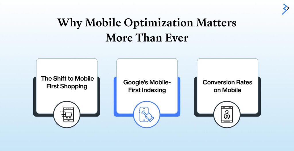
Mobile isn’t just an option in this digital world—it’s the expectation. From on-the-go browsing to voice search and impulse buys, mobile optimization on Adobe Commerce Cloud Services directly impacts your store’s visibility, engagement, and most importantly, conversion success.
1. The Shift to Mobile-First Shopping
Consumer behavior has drastically shifted. People no longer wait to get home to browse—they shop during commutes, in coffee shops, or while multitasking. Mobile convenience is the name of the game. If your Adobe Commerce Cloud store isn’t designed for smaller screens, you’ll struggle to capture and retain these users.
2. Google’s Mobile-First Indexing
Google now prioritizes mobile versions of websites for indexing and ranking. If your mobile experience is subpar, it can negatively impact your SEO, reducing visibility and organic traffic.
3. Conversion Rates on Mobile
A seamless mobile experience doesn’t just improve user engagement—it boosts conversions. In fact, studies show that mobile users convert 160% higher on sites that are optimized for mobile than those that aren’t.
Key Mobile Optimization Strategies for Adobe Commerce Cloud
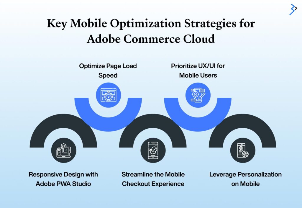
Your Adobe Commerce Cloud store must deliver fast, seamless, and user-friendly experiences to thrive in an increasingly mobile-first world. Here are the most effective strategies to optimize your store for mobile success:
1. Responsive Design with Adobe PWA Studio
Adobe Commerce Cloud supports Progressive Web Apps (PWAs), which combine the best of web and mobile apps. Using Adobe PWA Studio, you can:
- Deliver lightning-fast experiences
- Enable offline capabilities
- Improve cross-device performance
- Offer an app-like experience without needing users to install anything
Tip: For better brand alignment, use Venia, Adobe’s default PWA storefront, as a starting point or build a custom storefront.
2. Optimize Page Load Speed
Mobile users are impatient. If your site takes longer than 3 seconds to load, 53% will bounce. Here’s how to speed things up:
- Enable full-page caching (FPC) in Adobe Commerce Cloud
- Implement lazy loading for images and videos
- Minify and combine CSS/JS files
- Use Content Delivery Networks (CDNs) for faster regional loading

3. Streamline the Mobile Checkout Experience
Cart abandonment is one of the biggest challenges in mobile eCommerce. Simplify your mobile checkout by:
- Offering guest checkout options
- Reducing the number of steps in the checkout flow
- Supporting mobile wallets like Apple Pay, Google Pay, and PayPal
- Implementing auto-fill and address lookup features
4. Prioritize UX/UI for Mobile Users
Design elements need to be thumb-friendly, readable, and simple. Focus on:
- Tap-friendly buttons (at least 44×44 pixels)
- Easily scannable fonts and layouts
- Clear CTAs placed within thumb reach
- Collapsible menus and filters
5. Leverage Personalization on Mobile
Mobile users are looking for quick, relevant results. Use Adobe Sensei-powered personalization to:
- Display product recommendations
- Tailor content based on user behavior
- Send personalized push notifications (if your site is a PWA)
Read More – How to Set Up and Launch Your Store on Adobe Commerce Cloud
Advanced Technical Optimization for Mobile Performance
1. AMP (Accelerated Mobile Pages) Integration
AMP helps deliver mobile content faster by simplifying HTML and limiting JS usage. While not always necessary for a PWA-based site, some product and blog pages may benefit from AMP versions to improve SEO and load time.
2. Image Optimization
Uncompressed images are one of the top causes of slow mobile performance. Use:
- WebP format for lighter files
- Responsive image tags (<picture>)
- Compression tools like Adobe Media Optimizer or TinyPNG
3. Mobile-First CSS
Load CSS specific to mobile first to ensure speed and rendering priority:
- Use @media queries efficiently
- Remove unused styles
- Load critical CSS inline for first-paint optimization
4. Server-Side Rendering (SSR) with PWA
SSR enhances performance by pre-rendering HTML on the server side, making it instantly available to search engines and users. Use tools like:
- Adobe Commerce Cloud’s GraphQL caching
- Varnish and Redis for better server response
Enhancing Mobile Engagement with Smart Features
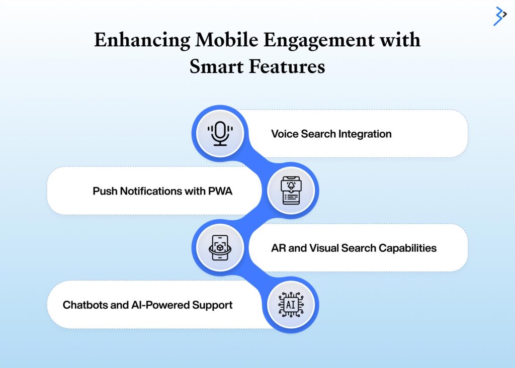
In today’s mobile-first world, simply having a responsive design isn’t enough. To truly captivate and convert mobile users, your Adobe Commerce Cloud store must incorporate intelligent, interactive features that make browsing, buying, and engaging easier and more enjoyable. Here’s how you can elevate mobile engagement with smart technology:
Voice Search Integration
As voice-enabled assistants become more common, optimizing your store for voice search is essential. Use conversational, natural language keywords on your product pages to align with how people speak, not just how they type.
Tools like Adobe Target and Adobe Experience Manager Services can dynamically tailor content based on voice search queries, offering smoother navigation and quicker access to products.
Push Notifications with PWA
Leverage the power of Progressive Web Apps (PWA) to enable push notifications, which keep users engaged even when they’re not actively browsing. These can:
- Alert customers about flash sales and exclusive deals
- Recover abandoned carts with timely nudges
- Deliver personalized recommendations based on browsing and purchase history
This real-time engagement boosts retention and conversion rates.
AR and Visual Search Capabilities
Through third-party integrations, Adobe Commerce Cloud supports Augmented Reality (AR) and visual search, allowing customers to:
- Visualize products like furniture or accessories in their real-world environment
- Search with images instead of typing, streamlining product discovery for mobile users
These features enhance decision-making and create immersive shopping experiences.
Chatbots and AI-Powered Support
Combine Adobe Sensei with chatbot tools to offer intelligent, 24/7 customer service. These bots can:
- Handle frequently asked questions automatically
- Provide personalized product suggestions
- Support customers through a conversational interface, reducing wait times and improving satisfaction
You can turn passive mobile visitors into loyal, engaged customers by embedding smart features into your mobile strategy.
Read More – SEO Strategies to Boost Visibility on Adobe Commerce Cloud
Mobile Testing and Continuous Optimization
To deliver a seamless mobile shopping experience on your Adobe Commerce Cloud store, testing and optimization should be a continuous process, not a one-time effort. Here’s how to keep your store in top mobile shape:
1. Use Google’s Mobile-Friendly Test Tool
Google’s Mobile-Friendly Test is a free and easy way to identify mobile usability issues.
- Detects problems with layout, font sizes, and tap targets.
- Offers suggestions to fix issues that may hurt the mobile experience or SEO.
- Helps ensure your site meets Google’s mobile-first indexing standards.
2. Leverage Adobe Analytics
Adobe Analytics gives deep insights into how users interact with your mobile store.
Track key mobile metrics such as:
- Bounce rate on mobile: Understand which pages lose mobile users.
- Funnel drop-off points: Identify stages in the purchase journey where users abandon.
- Product engagement: Discover which products attract the most attention on mobile.
Use this data to optimize layouts, personalize content, and simplify navigation for mobile shoppers.
3. Conduct A/B Testing on Mobile
What works on desktop might flop on mobile. Run A/B tests to find out:
- Which layouts convert better on small screens.
- Ideal button placements for thumb navigation.
- The most effective checkout flow for reducing mobile cart abandonment.
Use real-world data to inform design and UX decisions.
4. Monitor Performance with Lighthouse
Google Lighthouse provides a mobile-specific audit for key performance areas:
- Accessibility: Ensure your site is usable for all.
- SEO: Get tips on improving mobile search visibility.
- Best practices: Follow modern coding and UX standards.
- Speed: Identify bottlenecks and slow-loading elements on mobile.
Regular use of Lighthouse helps you fine-tune performance and maintain an optimized mobile store experience.
Read More – How to Set Up an Adobe Commerce Store: A Step-by-Step Guide
Real-World Examples of Adobe Commerce Mobile Success
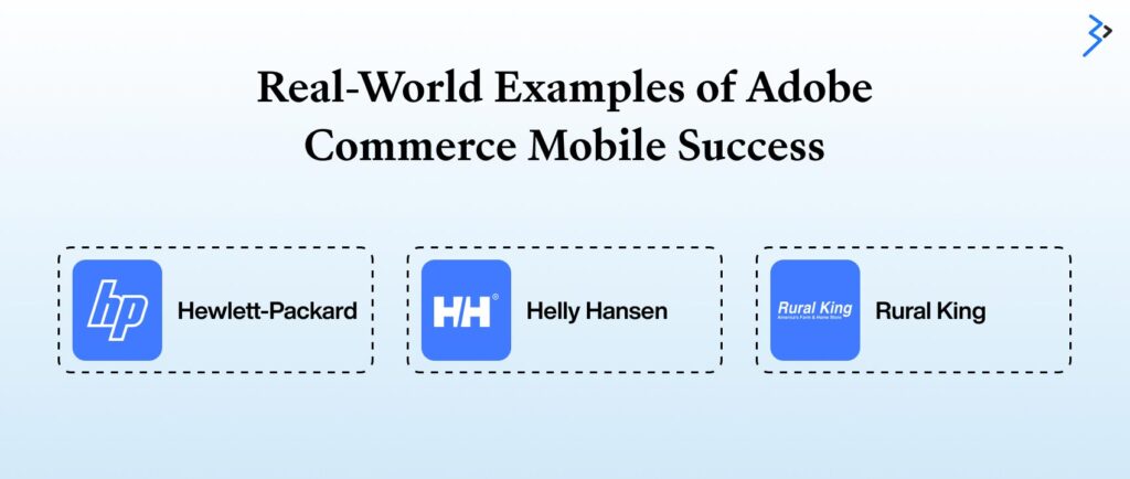
1. HP (Hewlett-Packard)
HP leveraged Adobe Commerce Cloud to create a seamless mobile shopping experience for global customers. By integrating Adobe Sensei for personalization and PWA Studio for fast loading, they achieved:
- 40% increase in mobile conversions
- Reduced bounce rates across mobile landing pages
2. Helly Hansen
This iconic outdoor brand built a PWA-based storefront, resulting in:
- 50% faster load times on mobile
- Higher mobile engagement and increased mobile sales
3. Rural King
The retail chain used Adobe Commerce Cloud’s flexible architecture to optimize its mobile experience, integrating:
- Personalized offers
- Streamlined checkouts
- Geolocation-based promotions
Best Practices to Keep Mobile Optimization Ongoing
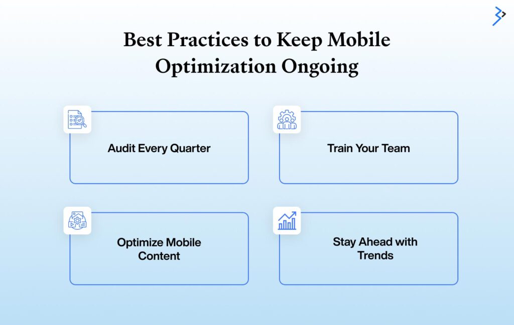
Mobile optimization isn’t a one-and-done task—it’s a continuous process that evolves with user behavior, device capabilities, and technology trends. Keeping your Adobe Commerce Cloud store fine-tuned for mobile requires strategic planning and regular action. Here are four essential best practices to ensure your mobile experience stays ahead of the curve:
Audit Every Quarter
Regular performance audits are key to identifying bottlenecks and improving the user journey.
- Use Adobe’s built-in monitoring tools to track speed, load times, and engagement.
- Leverage third-party tools like Google Lighthouse, PageSpeed Insights, or Hotjar for heatmaps and user behavior insights.
- Evaluate device/browser compatibility and prioritize fixes for high-traffic mobile segments.
Train Your Team
Your optimization efforts are only as strong as the team behind them.
- Conduct mobile-first design workshops for your designers and developers.
- Align your marketing team with best practices for mobile content structure and responsive layouts.
- Encourage cross-functional collaboration to ensure optimization is consistent across campaigns, design, and development.
Optimize Mobile Content
Mobile users want fast, focused, and visually digestible content.
- Keep text concise and to the point.
- Use high-quality images optimized for mobile viewing.
- Make CTAs large, clear, and thumb-friendly.
- Avoid copying desktop layouts—design uniquely for mobile user flow.
Stay Ahead with Trends
Being mobile-optimized today means preparing for tomorrow’s mobile landscape.
- Monitor advancements in voice commerce, AI chatbots, and visual search.
- Experiment with personalized mobile experiences using Adobe Sensei or third-party AI tools.
- Be ready to integrate new channels like wearables or AR-based shopping.
By integrating these best practices into your mobile strategy, your Adobe Commerce Cloud store will stay fast, user-friendly, and future-ready.
Conclusion: Future-Proofing Your Store for Mobile Commerce
Mobile commerce isn’t going away—in fact, it’s growing rapidly. As consumer expectations evolve, your Adobe Commerce Cloud store must be ready to meet them. By leveraging responsive design, accelerating performance, integrating smart features, and continuously testing and refining the experience, you can ensure your store not only meets but exceeds customer expectations.
Adobe Commerce Cloud gives you the tools, but how you use them defines your success. Whether it’s deploying a headless PWA, adding AI personalization, or simply fine-tuning your mobile checkout, every step toward a better mobile experience is a step toward higher engagement, conversion, and growth.
Start optimizing today, and give your customers the mobile experience they deserve.
Need help optimizing your Adobe Commerce Cloud store for mobile?
Let our certified Adobe Commerce experts create a custom mobile strategy to boost performance and conversions.
FAQs
Mobile optimization is critical because a majority of eCommerce traffic comes from smartphones. A well-optimized mobile store offers a better user experience, reduces bounce rates, increases conversions, and improves SEO rankings, especially with Google’s mobile-first indexing.
Adobe Commerce Cloud supports Progressive Web App (PWA) development through its PWA Studio. It also provides tools for responsive design, performance optimization, personalization via Adobe Sensei, and seamless integration with mobile payment systems.
Adobe PWA Studio is a set of tools for building Progressive Web Apps using Adobe Commerce. PWAs offer fast load times, offline access, app-like interactions, and smoother navigation—all optimized for mobile users.
You can improve mobile performance by enabling full-page caching, compressing images, minifying code, and using a CDN. Implement lazy loading and responsive design to ensure faster load times, smoother navigation, and an enhanced mobile user experience.
Keep it short and intuitive. Use guest checkout options, enable mobile wallets (Apple Pay, Google Pay), add address auto-fill features, and reduce form fields. The fewer steps, the better for mobile users.
Yes. Adobe Commerce Cloud integrates with Adobe Sensei, allowing you to personalize recommendations, offers, and content based on user behavior, device type, browsing history, and purchase patterns.
No. A responsive design or PWA ensures your existing site adapts seamlessly across all screen sizes, eliminating the need for a separate mobile version.
Use tools like Google’s Mobile-Friendly Test, Lighthouse, or Adobe Commerce’s performance monitoring dashboard. These tools evaluate your store’s responsiveness, loading speed, and usability on mobile devices.
Yes. Adobe Commerce Cloud supports integrations with third-party solutions for voice search, augmented reality (AR), and visual search, helping deliver innovative and engaging mobile experiences.
It’s best to audit your mobile performance quarterly. Monitor user behavior with Adobe Analytics, test different layouts, and keep up with emerging trends like conversational commerce and AI-driven support.

Related Articles
-
 Unlocking Operational Insights with an AI Assistant in Adobe Experience Platform
Designed as a generative AI tool, the AI Assistant in Adobe Experience Platform will transform how consumers interact with Adobe Experience Cloud apps like Adobe Customer Journey Analytics, Adobe Real-Time
-
 Integrate AEM with Salesforce: Your DIY Guide
Summary An organization is as successful as its software suite. Wonder why? Access to the best software allows organizations to streamline different aspects of their business and automate their workflow.
-
From RFP to Go-Live: How Enterprises Implement AEM Successfully
Imagine a world where your marketing team launches 65 hyper-personalized campaign variations in a single week, achieving a $1.2 million increase in Q3 revenue simply because your content could adapt