What Impact Does Google Material Design Have on Mobile App Design?
-

Bharat Patel
The way your Android app looks when users use it has a significant impact on their experience.
App consumers nowadays expect a personalized experience from their apps. They want an app to feel the same way their real-life aspects do. While this may appear to be a simple concept, it can be challenging to translate into a design.
Now, when it comes to building inclusive, interactive design features that evoke a sense of the material world, Google’s Material Design was a game-changer for mobile app developers.
With the arrival of material designs, the minimalistic flatness that had previously dominated the design world has been replaced by components of minimalistic interactive materials.
In this article, we’ll show how Material Design began to impact mobile app development companies all over the world. Along with the rules that underpin the standards and how they differ from graphic and material design. Finally, we’ll look at incorporating material design into mobile apps.
Before we delve further into the Google Material Design UI and its tips and tricks, let us quickly look back at how it started.
Let’s Look Into The History
When it comes to recognizing the value of Design, Google was a little late to the party. Today, it’s impossible to imagine a good design that doesn’t originate with Google.
So, how did this change take place?
This change was the product of Larry Page’s attempts to make everything appear attractive and linked when he took over the office.
A mandate that resulted in the birth of Google Material Design, a design standard that is now widely used and admired worldwide.
Google announced material design at Google IO Conference 2015 on May 25, 2013. This program is compatible with the latest Android versions after 2.1 and with the latest versions of appcomcat libraries.
Google aims to provide an overall consistent product experience by incorporating Material Design. Therefore, third-party developers are encouraged by Google to use their Material Design functionality to integrate Google’s functionality.
In May 2018, Google updated its guidelines for smartphones to address this critical problem. Many app developers dislike the material design.
Google needed to balance the consistency of material designs with differentiation – to allow designers the flexibility to adapt them to brands’ needs. Version 2 includes new guidelines and tools that allow for a variety of customizations of your designs.
What Is Material Design?
Material Design is a Google-developed Android design language that offers a touchscreen touch experience with cue-based features.
Designers improve the user experience through immersive, platform-compatible, interactive interfaces. Show how Materials Design fits with UX design.
Why Do Users Trust “Realer” Interfaces?
Material designs became Google’s brainchild in mid-2014, aptly named “Quantum Paper” and presenting the new “ink-pen” approach.
Material design enables customers to produce high-level production on platforms with consistent, high-quality output and gives the users a clear, pleasant appearance.
Contrary to skeuomorphism to depict culturally-related items, material designers employ simple natural physical laws relating to light and motion.
“Magical” And “Predictable” – An Indispensable Paradox
How should I design my products? How does this work? Is it necessary for me to understand the concept? The metaphor.
It should immediately make a user understand the functions of the app. The surface of the seams should provide hinting.
Use real light/shadowing for split design space. Adaptable Design ensures the same hierarchy of colors, icons, and spatial proportions across the entire device through adaptive versions choices.
What are the principles of Material Design?
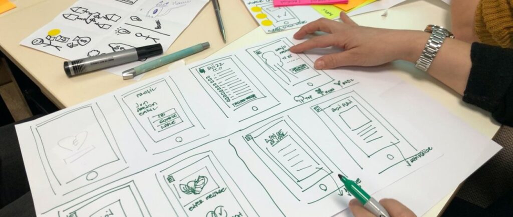
Material design apps follow three basic concepts pictured above. These principles will remain in force in every leading app developer (in this case, Google).
Motion Offers Meaning
Animation is a material design feature that has no effect on all the other designs elements or appears forced.
Instead, they appear as results of users’ first actions and follow their signals.
Although these are the three fundamental principles determining materials designs, two regulations define the globally accepted design standards — flexible base and cross-platform.
Material Is The Metaphor
The imaginative principle is grounded in studies on objects examined in different light conditions and how these objects appear in stacks above others. The principle has attributes such as edges, shadows, dimensions, and others.
Cross-Platform
Material design helps provide a similar interface to each platform and allows a standard component for the devices in a multitude — Android – Flash, Apple – Web.
So these five guidelines guide Android apps. This article shows the best ways to use UI principles in mobile apps.
Bold, Intentional, Graphic
The intention of creating white space within a web page and its use in bold and nevertheless synchronized colors and graphics that fit both screens’ screens in the right direction define Google’s material design principles.
Flexible Foundation
Material designs have the advantage of custom programming allowing mobile apps UI developers to incorporate branding elements into the design.
Best Apps That Revamped Their Design With Material Design Guidelines
Google Calendar
Google Calendar has a great number of features that have seen incredibly significant improvements due to the introduction by Google of Material Design guidelines.
The application provides valuable features, including graphics and maps, an introduction to events automatically, and an intuitive automated suggestion system for quickly adding appointments.
Gmail
Thanks to Material Design, email can be organized using Google Gmail cards. In addition to displaying new slideout menus, there’s now an afloat menu button to create new reminders.
Lyft
Lyft is another application using Material Designs. The app displays various controls with a map that shows the required information according to Google’s material design.
Buzzfeed
One of the apps that are gaining prominence on the site is Buzzfeed. The app is famous for its entertaining content.
But it has become well known for establishing standards in Google web developers for website development.
Google Maps
Google Maps is another software that uses Material Design and makes a significant difference.
According to recent reports, Google Maps has a new design that incorporates round and colored icons in the search section and white background, previously accessible in black and light grey.
How To Master Google Material Design in Your Android App?
Let us get you started with integrating those Android material design guidelines in your mobile app after providing you with a good overview of Google Material Design.
Following Android UX guidelines, here are some recommendations to help you construct a Google Material Design mobile app and become the design star of your Mobile app design company.
Use Shadows To Show Hierarchy
Google UUI guidelines are primarily used to show the UUI edge. Use shadows for the hierarchy of the layout elements and show what is on what.
The fundamental tool of Google’s UI standards are edges, surfaces, and realistic shadows. To demonstrate which element comes on what, use shadows to show the hierarchy of design elements.
Bold Colors
Intentionally, graphically – bold is Google’s mantra for mobile UI/UX design. Using colorful and colorful colors helps users experience interactive and exciting things while making apps more enjoyable.

Usage of Primary and Accent Colors
Google Material documents require developers of apps to choose three shades for their primary color and 1 for their accent color. The primary paint set could be used for font boxes, backgrounds, background, and accent color in the display area.
Extract Colors From The Images
Google encourages mobile application designers to get color from images and use those colors to develop pictures.
Incorporate Motion
Google is a prominent advocate of using motions to design apps. This helps us understand how everything moves in an app.
Make Everything Float
Generally, a mobile device can also be a visible design element. So, for example, your app’s buttons or CTAs will appear floating on the screen but not sitting flat on it.
Choice Of Icons
Icons improve the user experience when selected correctly. Material design interface offers you the choice of several icons based on two major categories – product icons and system icons.
Make The App Typographically Right
We recommend using noto typography for Android apps as they are more flexible to use.
Incorporate Responsiveness In Your Design
Material thrives on inconsistency. Similarly, it can appear in mobile apps. Therefore, all your design elements should function the same for each device you are interacting with.
The nine included tools will help implement new app development standards and design standards for upcoming releases. Now we can look in more detail at various Google app redesigns.
Android vs iOS: App UI Design Differences and Comparison
Human Interface Guidelines vs. Material Design
All of these differences in this article have been analyzed using this guideline. In conceptual terms, they are boiled into this as follows.
The Material consists of various fundamental principles: material-based metaphors, bold graphical-conscious animations, flexible base, and cross-platform capabilities.
Units Of Measurement: pt. vs. dpt
App design for iOS is made by pt., while Android apps are developed with DPI. Typically, the design is built at 1x (or mdpi) and uploaded at Zeplin. Zeplin displays iPad Designs in PTS and creates icons and illustrations in two and three-dimensional formats.
For Android, the designs can be shown in PSP and generate graphics in dppi, xpi, and xhdpi.
System Font: San Francisco vs. Roboto
Suppose your font doesn’t match your system font. For iOS, that’s Californian. Roboto is a mobile application.
Android, unlike iOS, includes a built-in reverse navigation feature. The Android Navigation Bar is located on the left side of the screen.
It’s either incorporated into the phone or is a user interface feature. The arrow can go back in time one step (reverse chronological navigation). Within an app or across apps, navigation works the same way. “However, why do we require two back buttons?”.
When you switch to a daughter page, you’ll see one in the bottom Navigation Bar and another in the top App Bar.
So, here’s the solution. Reverse navigation can be divided into two types: Back navigation (using the back arrow in the Navigation Bar; we call it “back”) is a method of going backward in time upward navigation (using the arrow at the top of the screen; we refer to this as “up”).
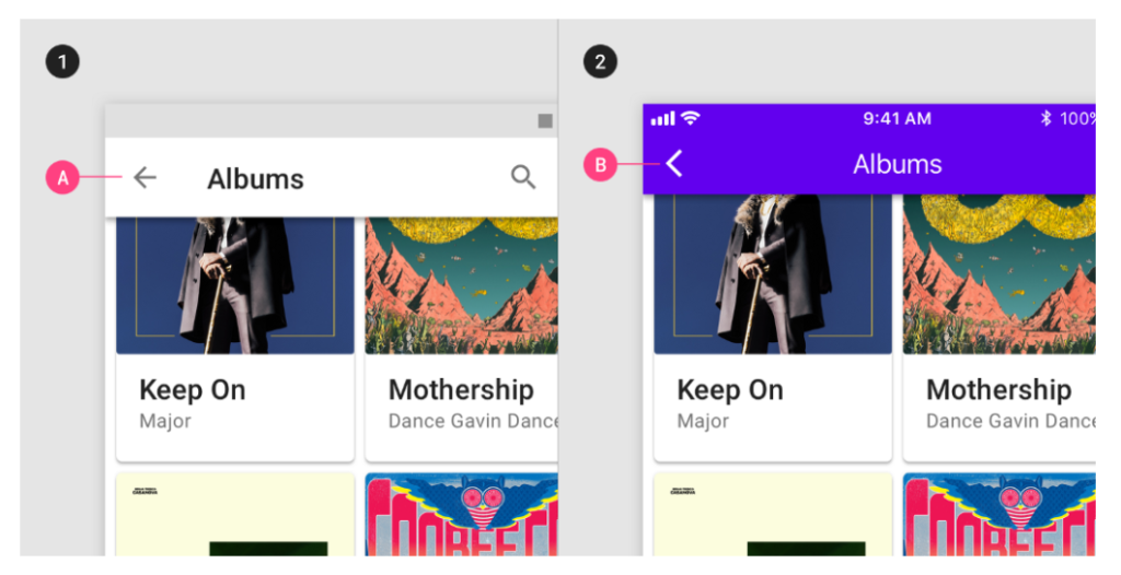
Consider a path with three points: A, B, and C, with A representing the mother page and B and C representing the daughter pages. Assume the user moves from point A to point C. They’ll return to A if they hit the back button, but if they push the up button, they’ll go to B, and a second press will return them to A.
Because this is difficult to implement and confusing for the user, these two buttons now both perform the same thing: they return the user to the previous screen, just like on iOS. In other words, if the user travels from A to C, it will return to A.
The Importance Of Elevation In Material
In theory, iOS doesn’t have any shadows. Shadows can be seen on the main screen of the App Store and in Health as an exception. However, the HIG does not allow for shadows in any fashion.
Shadows have an essential part in Material. They give the interface a third dimension (the Z-axis), allowing each component to have its unique placement along this axis (from 0dp to 24dp). Furthermore, this Z-axis isn’t only conceptual; developers may utilize an “elevation” parameter to control the location of items along this axis.
What Is Android Material Design’s Next Step?
We used Material Design 2.0 to update the structure after updating the design world standard using the Material Design Guide.
With a rectangular interface for bidding and a turn-to-round mobile UI design, the 2nd-generation material design will survive the following few days.
With the new Creative Design Application Guide, we want to improve all major products, including Gmail, Google Search, and Google Maps.
Material Design 2.0 — The goal of Material Design 2.0 is to improve efficiency, readability, and clarity, resulting in the cleanest user interface to date.
Conclusion
So there it was, the Android Material Design guide for Android App Designers and Android App Development Companies that had just entered the field of Android app design.
Material design is a vital aspect of an app’s UI and UX strategy. This app will enable standardized user interfaces for the Google platform. It will help avoid user confusion. These design elements were created to reflect a desire to provide the user with an excellent experience by providing “pen and paper” style. Currently, Google has an assortment of materials that reflect the design in every product line — and most products have already done this.
To prepare your app to enter the list of the most excellent Google material design apps, consult our team of Mobile UI/UX Designers today, whether you’re a designer or a business aiming to rule the millions of Android hearts.

Related Articles
-
 Five Benefits Of Implementing A Mobile Point-of-Sale System
Talking About Five Benefits Of Implementing A Mobile Point-of-Sale System, It is clear that retailers are making the use of mobile technology to run their business more effectively. The mobile
-
 How Do Free Apps Make Money in this era?
How does a free app generate income? Typically, this question is asked during app development and by customers. For example, how does a user download downloadable apps for free? How
-
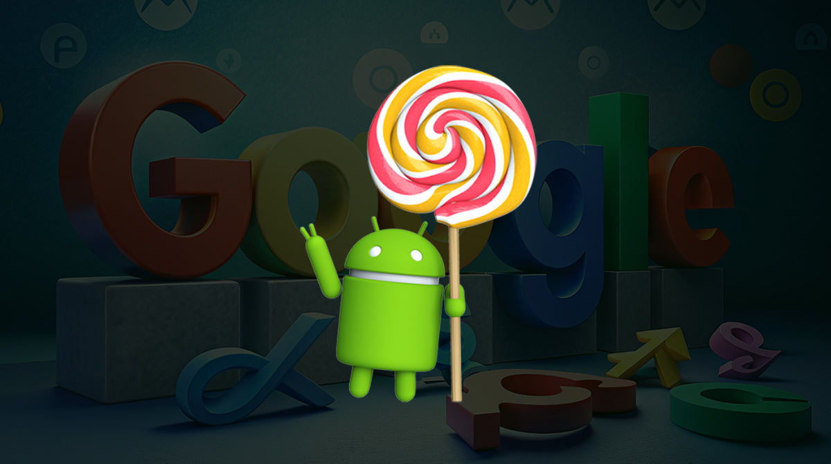
 Google Announces Release Of Android 5.0 Lollipop
Great news by Google again! It has recently announced the release of Android 5.0 Lollipop designed to be flexible to work on all the mobile devices and can be customized