How to make your WordPress Website Mobile-First
-

Saumil Kalaria

The amount of internet surfing that is happening through mobile devices these days has increased significantly and has exceeded desktop usage for browsing. Considering this, mobile phone users have notably become google’s new target. Google rolled out an announcement that its search engine indexing will transition mobile-first.
Mobile-first design is an approach where website development is primarily focused on the user experience for mobile users over the desktop.
Hence, optimizing WordPress websites for mobile is paramount. It makes the website look more intuitive and actionable on mobile phones.
And with profound WordPress Development Services, you can seamlessly make a responsive and fully functioning mobile version of your WordPress website, ensuring that the Google guidelines are properly imposed.
In this blog, we are going to walk you through the needs to make any WordPress website mobile-first.
[Also read: What Makes Omnichannel The Best To Feed Your Ecommerce Needs?]
Why do you need to make any website mobile-first?
To shed more light on why you need to make any website mobile-first, let’s go through google’s guidelines once.
As we are aware that people spend more and more time surfing the Internet for searching any information from mobile. And, naturally, this shift from desktop to mobile use continued to grow. Google clearly declared that special weightage will be given to websites that follow the mobile-first design. Whereas, Non-mobile-friendly websites will be penalized by the search engine giant. In this scenario, if your website isn’t ready for mobile screens yet there is a possibility that you end up losing the place you hold in the search engine, and with time you might also lose on revenue.
The reason being, it is easy to engage the mobile audience as they are more active on their mobile phones than on their laptops.
The Google mobile-first approach emphasizes factors like:
- Image size
- URLs and interlinking
- Content’s length
- Site’s loading speed on mobile
- Mobile responsiveness
- The text blocks should be prominent and clear on smartphones
If you run an online business, you should consider all these factors to develop a website that scores well on Google PageSpeed and offers an excellent user experience for your mobile audience. Discover your true business potential with the help of Brainvire’s dynamic eCommerce development services.
How to make any WordPress website mobile-first?
Websites that were developed following the conventional methods of website development are without a doubt optimized for desktops. Hence, there is a chance that their mobile phone experience is not that user-friendly for the audience. Which can possibly make it difficult for the users to traverse through the site on mobile and they end up leaving the site.
In this case, you need to offer a user interface that is optimized keeping mobile users in mind and engages as much as it’s possible. And it can be achieved by optimizing the following constraints:
Managing content
Mobile content cannot be as detailed as desktop content. The content provided on the mobile screen must be completely configured in terms of font size and the blocks in which it is written. To ensure that content is readable over the mobile screen of any size, careful attention has been paid to font size.
[Also Read: 11 Steps to Create an Easily Accessible WordPress Website]
Optimize Images
As a result, there is no need for horizontal scrolling, and the user can find the desired amount of content at certain parts. For example, content is written below every product and potential customers can learn more about the product by clicking on the text.
Images on the mobile screen appear much smaller than on desktop screens, and their quality suffers as a result of the smaller screen. Since the mobile screen is so small, pictures had to be clipped from the ends otherwise they are not in the best format. Images should be optimized in such a way that they maintain their quality while maintaining a ratio that is ideal for smaller screens. This can be done by decreasing the width of the image and placing the action button in the appropriate position. The product page would then have plenty of room for the product’s picture.
If you are looking for the right eCommerce development solution to take your business to the next-level, contact Brainvire today.
Improve loading speed
The page loading speed on mobile is one of the most significant issues with websites with many products and services. As a matter of fact, cell phones don’t normally load a large amount of website data at once. So whenever a user lands on a website and if its pages take more than 3 sec to load, they probably leave the page.
As a solution, you can reduce the image size while maintaining the image’s quality. Moreover, the content is distributed on several pages. Thus, product photos are quickly loaded on the screen of a mobile user, the text portion in the background takes time to load.
If every website is designed for mobile phones first, every section of the site will be optimized for mobiles. It will be tested over all the tools and build undertaking google’s guidelines.
[Also read: E-commerce Factors You Need to Leverage to Boost Sales and Visibility]
Bottom line
In less than 2 years, mobile audiences overtook desktop audiences and became more important than ever. The mobile audience is the oxygen of the e-commerce industry. So, if you haven’t moved your site to mobile yet, the time is now. Move your site to mobile and get ahead of the competition. Concentrate on making your site mobile-friendly and completely responsive, managing content, optimizing images and improving loading speed, and putting mobile-first are some key factors you need to take care of while optimizing your website for mobile.
Though developing a fully responsive native mobile app with the help of a highly qualified mobile app developer is one alternative to gain traction, it can cause you ample time and effort. Instead, you can hire WordPress designers and optimize your e-commerce website to make it responsive and mobile-friendly on your own.

Related Articles
-
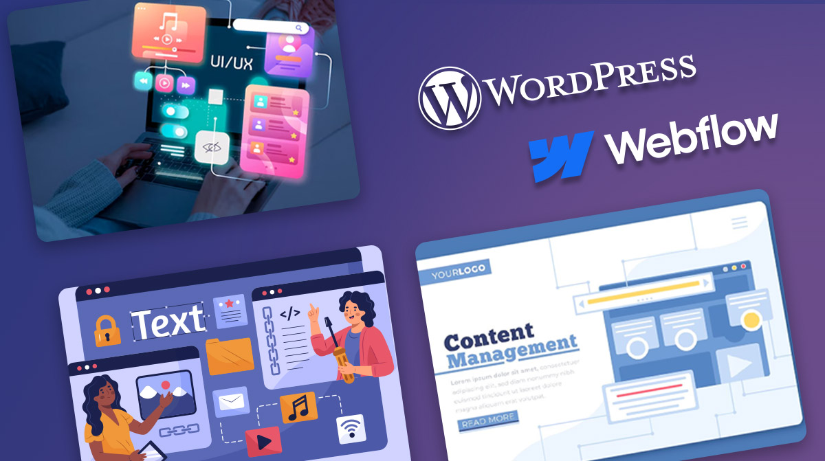
 Choosing the Right CMS for Your Business: A Comprehensive Guide to Webflow vs WordPress
When compared between WordPress and Webflow, two popular website-building platforms, WordPress appears as a more popular open-source content management system that allows greater flexibility through plugins. On the other hand,
-
 Experience an Exponential eCommerce Growth with WordPress Website
Are you planning to enter the digital realm or kick-start your home business? In either of the situations, you need WordPress development services to build an eCommerce website. Today, modern
-
How much will a website development cost you?
How much does it cost to create a website? How much do you charge for a website? How much does it cost to host a website? How much does it