A Step-by-Step Guide to Building a Power BI Interactive Dashboard
-

Pratik Roy

In today’s data-driven ecosystem, the way organizations perceive and leverage data defines their ability to adapt, innovate, and lead. Simply collecting data is no longer enough—extracting actionable insights through compelling visualizations is what creates impact. Microsoft Power BI, a leading business analytics tool, enables organizations to transform raw data into interactive dashboards that facilitate real-time decision-making, foster collaboration, and improve visibility across all departments.
This guide walks you through the entire process of creating a Power BI interactive dashboard, from understanding the fundamentals to publishing and sharing actionable insights.
1. Introduction to Power BI and Interactive Dashboards
Power BI is a cloud-based business intelligence platform by Microsoft that enables users to visualize data and share insights across the organization. An interactive dashboard in Power BI is a dynamic, single-page visualization canvas that brings together various visual elements—such as charts, tables, maps, and KPIs—to deliver a cohesive narrative around business metrics.
The power of interactivity lies in its ability to let users filter data, drill down into specifics, and understand the “why” behind trends—all in real-time.
2. Why Choose Power BI?
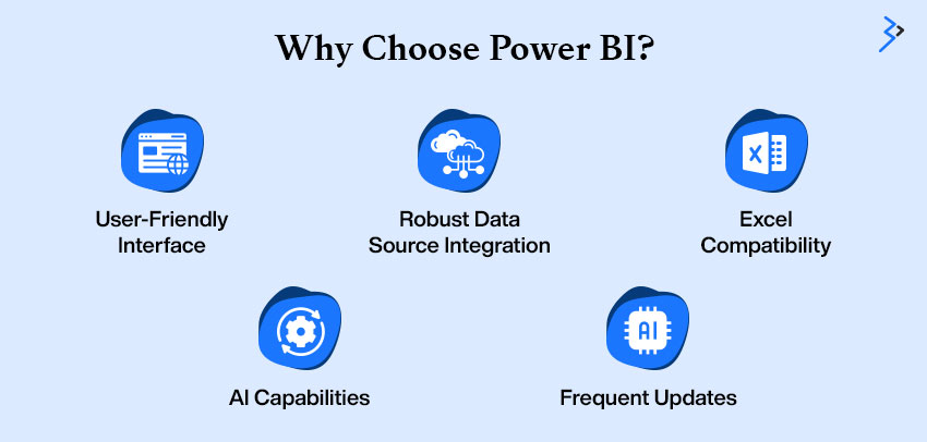
There are several reasons why Power BI Development is the preferred BI solution for businesses of all sizes:
- User-Friendly Interface: With drag-and-drop functionality and prebuilt visuals, even non-tech users can build dashboards.
- Robust Data Source Integration: Connects with over 100 data sources, including Excel, SQL, Salesforce, and cloud platforms.
- Excel Compatibility: Seamlessly integrates with Excel, allowing users to import tables, pivot charts, and formulas.
- AI Capabilities: Features like Q&A (natural language queries) and smart narrative help uncover hidden insights.
- Frequent Updates: Microsoft regularly rolls out new features based on user feedback.
3. Planning Your Dashboard Project
Planning sets the foundation for an effective Power BI dashboard. It ensures your visuals serve real business goals and reach the right audience.

Key Planning Steps:
- Identify Business Objectives
- Define the purpose of the dashboard (e.g., track sales, monitor support tickets).
- Define the purpose of the dashboard (e.g., track sales, monitor support tickets).
- Determine Stakeholders
- Understand who will use it—executives, analysts, or sales teams—and tailor views accordingly.
- Understand who will use it—executives, analysts, or sales teams—and tailor views accordingly.
- Define KPIs
- Select measurable, relevant, and actionable indicators like revenue growth, churn rate, or cost-per-acquisition.
- Select measurable, relevant, and actionable indicators like revenue growth, churn rate, or cost-per-acquisition.
- Sketch a Wireframe
- Draft a layout that outlines the visual hierarchy and data story flow.
- Draft a layout that outlines the visual hierarchy and data story flow.
- Choose the Right Data
- Source accurate, timely, and business-relevant data from systems like CRM, ERPs, or spreadsheets.
Example Planning Table:
| Step | Example | Purpose |
| Business Objective | Monitor regional sales trends | Support sales strategy decisions |
| Stakeholder | Sales Managers | Empower with real-time insights |
| KPI | Monthly Sales by Region | Track performance against goals |
| Wireframe Element | Map with bar charts by region | Visualize regional performance |
| Data Source | Salesforce CRM, Excel sheets | Ensure up-to-date, trustworthy input |
4. Data Preparation and Import
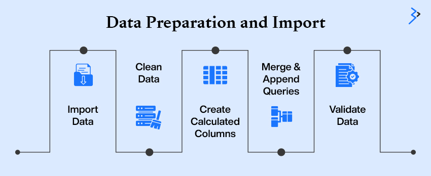
Data preparation is arguably the most critical phase in dashboard creation. Power BI provides Power Query Editor for data cleaning, transforming, and shaping.
Steps Involved:
- Import Data: Load data from Excel, SQL Server, SharePoint, web APIs, and more using Power BI Desktop.
- Clean Data: Eliminate duplicate entries, handle missing/null values, and apply consistent data formats.
- Create Calculated Columns/Measures: Use DAX (Data Analysis Expressions) to generate dynamic values such as KPIs, percentages, or custom rankings.
- Merge & Append Queries: Use joins to merge related tables or append to a stack of similar datasets.
- Validate Data: Ensure consistency and accuracy before visualizations to maintain credibility in insights.
Clean and well-prepared data forms the backbone of any reliable dashboard, enabling precise visual storytelling.
Read More – Mastering Data Visualization with Power BI
5. Modeling and Relationships
Power BI operates on a structured data model that defines how your tables connect and interact.
What You Need to Do:
- Define Relationships: Drag and drop to link tables using primary and foreign keys in model view.
- Choose Relationship Types: Select one-to-many or many-to-one based on the dataset’s natural hierarchy.
- Use Star Schema: Organize data with a central fact table and multiple dimension tables for simplified queries and optimized performance.
- Enforce Referential Integrity: Ensure relationship accuracy by validating data consistency between linked tables.
- Hide Unused Fields: Streamline the model by hiding irrelevant columns for end users.
Proper data modeling enhances calculation speed and dashboard scalability, ensuring a seamless user experience.
6. Designing Your Dashboard
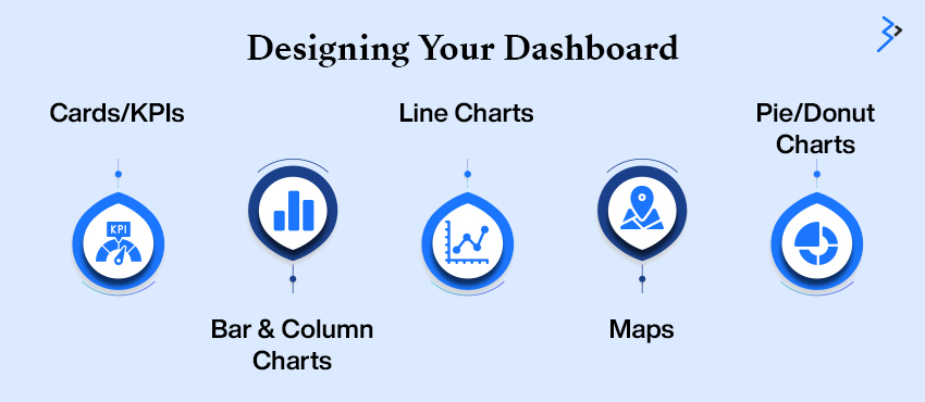
Dashboard design is where raw data transforms into meaningful insights. Choosing the right visuals is key to effectively telling your data story and guiding user decisions.
Key Visuals:
- Cards/KPIs: Highlight important metrics like total revenue, active users, or conversion rate.
- Bar & Column Charts: Compare categories such as product sales or departmental performance.
- Line Charts: Showcase trends over time like monthly growth or seasonal behavior.
- Maps: Visualize geographic data, including customer distribution or regional sales.
- Pie/Donut Charts: Represent proportions, such as market share or product mix.
Design with purpose—place KPIs at the top for quick insights, trends in the center for contextual understanding, and detailed breakdowns at the bottom for deeper analysis. Use consistent colors, avoid clutter, and prioritize readability. An intuitive, well-structured dashboard enhances user experience and drives informed decision-making.
7. Making It Interactive
This is where Power BI truly shines—transforming your dashboard from static visuals into an engaging, exploratory experience. Every chart can act as a control element, empowering users to dive deeper into the data.
Interactivity Features:
- Slicers: Enable users to filter by time periods, geographic regions, or product categories to tailor their view.
- Drillthroughs: Click on a specific data point to navigate to a detailed report page focused on that item.
- Bookmarks: Save customized views and easily switch between different perspectives or scenarios.
- Q&A Box: Ask natural-language questions like “What are the top 5 regions by sales?” for instant insights without complex queries.
- Tooltips: Hover over visuals to reveal additional data points, context, or supporting metrics without cluttering the main view.
These interactive elements transform dashboards into dynamic environments where users can explore trends, uncover patterns, and make informed decisions with ease.
Read More – Harnessing Data Insights: Power BI’s Impact on the Energy Industry
8. Performance Optimization
A well-designed dashboard can quickly lose its appeal if it’s sluggish or lags during use. To ensure your users have a smooth experience, optimizing performance is key.
Start by limiting the number of visuals on each page to avoid clutter and make sure the focus stays on the most critical data. If you’re dealing with large datasets, it’s crucial to use aggregated data and summarize it before importing to reduce the load. You can also disable the Auto Date/Time feature in Power BI’s settings to make the data model leaner.
When working with complex DAX calculations, try to avoid performing them on the fly, as this can slow down processing. Instead, pre-calculate where possible. For enterprise-level data loads, consider using incremental refresh, which updates only the data that’s changed, rather than reloading the entire dataset.
By optimizing performance, you not only improve the speed of data exploration but also enhance the overall user experience, making your dashboard a powerful tool that’s both quick and reliable.
9. Sharing and Collaborating
Once your dashboard is ready, ensuring it’s shared securely and conveniently across teams is vital for maximizing its impact. Below are the key options for sharing your Power BI dashboard:
| Sharing Option | Description |
| Publish to Power BI Service | Host your dashboard on the cloud services for easy access across teams and devices. |
| Create Workspaces | Set up workspaces to collaborate with team members while defining who can view or edit specific content. |
| Embed in Microsoft Teams | Enhance real-time discussions by embedding the dashboard directly into Microsoft Teams, allowing seamless collaboration with live data. |
| Mobile Optimization | Ensure the dashboard is responsive on mobile devices for easy access to insights on the go. |
| Export to PDF/PPT | Export your dashboard as a PDF or a PowerPoint presentation to share offline during meetings or for documentation purposes. |
With these sharing mechanisms in place, your dashboard becomes a versatile tool for collaboration, allowing teams across departments to interact with and make decisions based on real-time insights.To make sharing these insights easier, an AI PowerPoint maker can help transform data into well-designed slides for presentations or reports.
10. Real-World Use Cases
Power BI dashboards are game-changers across all business functions, turning data into actionable insights and helping teams make informed decisions quickly. Here’s how different departments benefit from Power BI:
| Business Function | Key Use Cases |
| Sales & Marketing | Track campaign performance, measure lead conversion rates, analyze customer segmentation to refine strategies, and optimize ROI. |
| Finance | Monitor budget variance, track expenses, and conduct cash flow analysis to ensure financial stability and timely adjustments. |
| Operations | Manage inventory levels, assess supplier performance,and track process efficiency for cost savings and improved supply chain management. |
| HR | Analyze employee engagement, track attrition rates, and assess headcount distribution to develop more effective retention strategies and workforce planning. |
| Customer Service | Measure ticket resolution times, monitor CSAT scores, and track support KPIs to improve customer satisfaction and service efficiency. |
Custom dashboards tailored to each department allow for a focused view of the most relevant metrics. This ensures that teams can quickly interpret data and take actionable steps, enhancing both productivity and strategic decision-making.
Power BI’s ability to integrate data from multiple sources and present it makes it indispensable in any business function, empowering teams across sales, finance, operations, HR, and customer service to work smarter.
11. Best Practices for Visual Appeal and Functionality
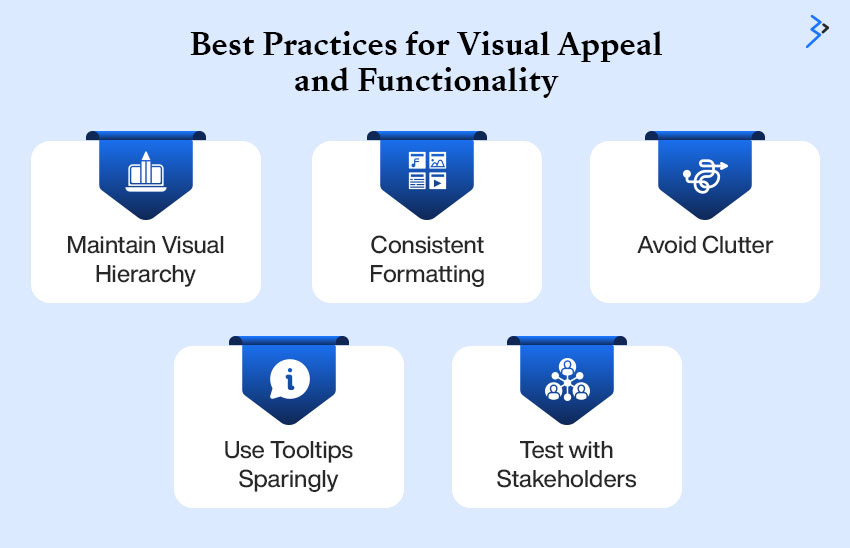
Creating an effective Power BI dashboard is about finding the perfect balance between design and usability. It’s not enough for a dashboard to just look good—it needs to be functional, intuitive, and provide value through actionable insights. Adhering to a few design best practices can elevate both the aesthetics and performance of your dashboard.
Maintain Visual Hierarchy:
A visual hierarchy guides the user’s attention to the most critical elements first. Place high-priority Key Performance Indicators (KPIs) at the top or in prominent positions. Use contrasting colors to highlight these crucial metrics, ensuring they stand out from the rest of the visuals. This helps users immediately identify the key insights.
Consistent Formatting:
Consistency is key to a polished and professional-looking dashboard. Fonts, colors, and icons should align with your company’s branding guidelines to maintain a cohesive look across all your reports. Consistency also enhances usability by making the interface intuitive and easier to navigate.
Avoid Clutter:
Cluttered dashboards are confusing and overwhelm users with too much information. Use white space effectively to give the visuals room to breathe, making the data more digestible. Limit text blocks and avoid displaying unnecessary details that don’t add value to the overall insights.
Use Tooltips Sparingly:
Tooltips can be incredibly helpful, but they should be used strategically. Overusing them can create distractions and hide key information. Place tooltips where users will need additional context or when offering extra details about data points. This helps keep the dashboard clean while still providing helpful information when necessary.
Test with Stakeholders:
A successful dashboard serves the needs of its users. Engage with stakeholders early in the design process and gather feedback on a regular basis. Testing the dashboard with actual users helps identify pain points, unclear visuals, or any areas for improvement. Iterating based on this feedback ensures that the final product is as effective as possible.
Remember, a dashboard is a tool, not just a decorative element. If it’s visually appealing but fails to provide actionable insights, it misses its purpose.
Read More – Personalized Data Experiences with Power BI Reports for Multiple Metaverse Avatars
12. Common Mistakes to Avoid
Knowing what not to do is equally important.
| Mistake | Explanation |
| Overloading Pages | Too many visuals can confuse users rather than providing clarity. |
| Poor Data Quality | Incorrect or incomplete data leads to wrong insights and erodes user trust. |
| Neglecting Mobile View | Many stakeholders use smartphones, so dashboards should be optimized for mobile devices. |
| Ignoring User Feedback | Continuous iteration based on user feedback ensures the dashboard remains relevant and effective. |
| Forgetting to Document Logic | Not documenting calculations and filters makes it hard to maintain or update the dashboard. |
These mistakes can significantly compromise the credibility and usefulness of your dashboard, so it’s essential to avoid them for optimal performance.
13. The Future of BI Dashboards
As business intelligence evolves, dashboards are becoming more intelligent, predictive, and automated.
Emerging Trends:
- AI-Powered Insights: Automated trend detection and anomaly alerts.
- Natural Language Generation (NLG): Dashboards that explain themselves in plain English.
- Data Storytelling: Combining visuals, narrative, and emotion for impact.
- Real-Time Dashboards: Stream analytics from IoT development company, CRM, or web platforms.
- Augmented Analytics: Using ML models to recommend KPIs or visuals.
Power BI continues to innovate in alignment with these trends.
14. Final Thoughts
Building an interactive Power BI dashboard is a blend of art and science. It’s not just about graphs and charts—it’s about communicating a story that prompts action. A great dashboard:
- Brings clarity
- Facilitates collaboration
- Drives strategy
As organizations grow, their reliance on visual analytics will deepen. Those who master tools like Power BI will not only gain a competitive advantage but also foster a data-informed culture that thrives on visibility and accountability.So, take the leap. Build dashboards that don’t just show data—but inspire decisions.

Related Articles
-
 4 Types of Data Analytics to Overcome Business Challenges
At Bombora’s Second Annual Intent Event in September 2019, I noticed a unique trend among several successful B2B sales and marketing teams. Most of the presentations shared a common way
-
Benefits of Power BI: How Different Can Industries Use Power BI in 2023?
Currently, the market value of Power BI is about 4.48% with almost close to 10,000 companies already using it. Technologies such as the Internet of Things, Artificial Intelligence, and others
-
 Excel v/s Power BI- Time To Switch Your Reporting Practices
Modern businesses know the significance of data analysis and are trying to make the most of it. Research states that firms generate about 44 trillion GB data annually. With such