Power BI has long been recognized as a leader in business intelligence tools, providing a seamless experience for data analysis, visualization, and storytelling. One of the key contributors to its success is the vibrant ecosystem of third-party visuals—none more dynamic and feature-rich than those from ZoomCharts. Known for their interactivity, sleek design, and intuitive navigation, ZoomCharts visuals empower users to dig deeper into their data with minimal friction.
With the February 2025 release, ZoomCharts has introduced several powerful updates to its Power BI custom visuals, including:
- Extended axis label support in Combo, Combo Bar, and Waterfall visuals
- Lasso shape layer assignments in Map visuals
- Custom display names for link categories in Graph PRO
Let’s break down these features in detail to explore how they enhance usability, flexibility, and the overall storytelling potential in Power BI. With the right Power BI Consulting Services.
1. Extended Axis Labels: Making Data Legible Again
Why Axis Labels Matter
When it comes to visualizations, clarity is king. A well-structured chart can quickly lose its effectiveness if axis labels are truncated, unclear, or forced into awkward abbreviations. Labs must remain intact and readable in sectors like finance, manufacturing, or healthcare, where category names are long or technically nuanced.
Previously, Power BI visuals might trim or compress long-axis labels, especially when horizontal space is limited. This led to confusion and forced analysts to rely on hover tooltips or external legends, hampering efficiency.
What’s New?
ZoomCharts just rolled out an exciting update to its visuals—Combo, Combo Bar, and Waterfall charts now support extended axis labels. That means longer category names on both X and Y axes are fully visible without any cut-offs, cramped text, or makeshift workarounds. No more trying to decode abbreviations or hovering for tooltips just to understand what a label says.
Why This Matters:
- Enhanced Readability: Every word counts—especially in business data. Now your charts clearly display full category names, making insights easier to grasp.
- Cleaner Dashboards: With no need for added text boxes or workarounds, your dashboards stay sleek and professional.
- Productivity Boost: Skip the manual fixes and save time—let the visual do the work for you.
Real-World Use Case
Imagine you’re managing sales analytics for a large retail chain. Store names like “North-East SuperMart, Chicago Downtown” or “Southwest Regional MegaStore, TX” often got cut off in axis labels. Not anymore. This update ensures your visuals reflect accurate, readable data, so stakeholders get instant clarity without guesswork.
Whether you’re analyzing performance, planning expansions, or sharing insights with non-technical audiences, this small-but-mighty enhancement makes a big difference in how data is presented—and understood.
Try it today and see your data stories come to life with clearer, smarter visuals.
2. Lasso Shape Layer Assignment: More Control in Map Visuals
The Power of Lasso Tools
Geospatial analysis has become a cornerstone of data-driven decision-making. Whether it’s tracking sales by zip code, plotting supply chain nodes, or analyzing real estate heatmaps, maps offer a spatial dimension that tables or bar charts simply can’t.
ZoomCharts’ lasso selection tool was already a favorite feature. It allows users to draw freeform shapes on maps and select the data points within that boundary. Now, ZoomCharts has taken this feature to the next level.
What’s New?
This latest update brings a powerful upgrade to your mapping toolkit: the ability to assign lasso-drawn shapes to specific Shape Layers. Now, every shape you draw can be:
- Assigned to a unique layer
- Independently styled (custom color, opacity, borders)
- Shown or hidden based on zoom levels
This game-changing feature transforms static maps into dynamic, interactive canvases that let you tell more meaningful stories with data.
Key Benefits
- Organized visualization: Keep shapes grouped by category, theme, or data layer
- Simplified storytelling: Use colors and zoom-based visibility to direct viewer focus
- Enhanced interactivity: Toggle individual layers on/off for deeper exploration and analysis
Real-World Use Case
Picture a logistics manager overseeing a city-wide delivery network. With Shape Layers, they can draw zones for:
- High-priority deliveries (red layer)
- Medium-priority areas (yellow layer)
- Low-priority regions (green layer)
Each zone sits on its own layer, styled accordingly. When zoomed out, only high-priority zones display for clarity. As the map zooms in, medium and low-priority areas appear, giving a layered, context-aware view that supports smarter decision-making.
Whether you’re mapping sales territories, tracking environmental zones, or managing city infrastructure, this update helps you organize, analyze, and present spatial data like never before.
Are you ready to bring your maps to life?
Read More – A Step-by-Step Guide to Building a Power BI Interactive Dashboard
3. Custom Display Names for Link Categories in Graph PRO
Why Graph Visuals Are Crucial
Graph visuals are powerful tools for representing networks—be it supply chains, organizational charts, IT infrastructure, or even social connections. However, these visuals can become overwhelming when multiple link categories (e.g., communication type, connection strength, or dependency) are involved.
Previously, managing these link categories often meant sticking to internal naming conventions or default field names that might not translate well to external audiences.
What’s New?
ZoomCharts Graph PRO now supports custom display names for link categories, enabling users to replace technical backend field names with business-friendly labels. This enhancement ensures your visualizations are technically accurate and easy to interpret for non-technical audiences.
Here’s what this means for you:
- Customize link labels in the legend
- Avoid cluttered or unclear system names
- Improve readability for broader stakeholder groups
Key Benefits
- Enhanced clarity: Legends now use language that aligns with your business context.
- Improved collaboration: Easier for teams to interpret and act on network visualizations.
- More professional presentations: Tidy, tailored labels elevate the aesthetic and usability.
Real-World Use Case
Imagine an IT operations team using Graph PRO to map network interactions. Instead of displaying confusing labels like comm_type_01 or link_ref_09, they can now label connections as VPN Tunnel, Email Relay, or API Sync.
This helps even non-technical stakeholders—like project managers or executives—grasp the graph’s meaning at a glance.
This update improves Graph PRO’s usability, readability, and alignment with real-world needs. Dive in and start customizing!
4. Additional Noteworthy Enhancements

Beyond the spotlight features of the February 2025 release, ZoomCharts has introduced a suite of refinements designed to elevate the user experience in Power BI. These enhancements streamline workflows, enhance visual clarity, and ensure optimal performance for even the most demanding dashboards.
Hide Empty Tooltip Rows
Tooltips are essential for presenting contextual data, but empty rows often dilute their impact. With this new feature, ZoomCharts now intelligently hides rows with no values—offering a cleaner, more concise tooltip that highlights only relevant insights.
Tooltip Styling Improvements
The upgraded tooltip styling options combine aesthetics with functionality. Users can now fine-tune tooltip appearance by modifying fonts, adding custom headers, or drawing attention to key data fields. These enhancements allow for improved readability and better alignment with brand or report design standards.

Improved Performance for Large Data Sets
As datasets grow, performance can lag—but not with ZoomCharts. The latest update supercharges the rendering engine, making it significantly more responsive even when handling extensive node or shape counts. Users can now explore complex visualizations—like multi-layered network graphs or high-volume geospatial maps—without sacrificing speed or fluidity.
These behind-the-scenes improvements may not make the headlines, but they play a vital role in refining how users interact with ZoomCharts visuals in Power BI. Together, they contribute to a more polished, high-performing reporting experience that balances functionality with finesse.
Read More – Mastering Data Visualization with Power BI
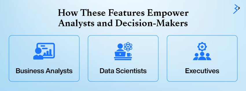
5. How These Features Empower Analysts and Decision-Makers

Data is only as valuable as the insights you can extract from it. ZoomCharts helps bridge the gap between raw numbers and actionable intelligence. Here’s how:
| User Role | Key Benefits |
| Business Analysts | – Save time with auto-axis formatting- Build complex maps seamlessly- Simplify network visuals for stakeholders |
| Data Scientists | – Visualize intricate links without clutter- Use lasso tools for spatial exploration- Style reports without developer help |
| Executives | – View clear, intuitive dashboards- Interact with insightful maps and graphs- Make confident, fast decisions |
ZoomCharts Visuals for Power BI bring measurable value across professional roles. Business analysts benefit from automation that eliminates tedious formatting, helping them focus on insights rather than design.
Layered maps and clear network charts can convey complex data in a digestible form. Data scientists gain flexibility in clearly presenting intricate relationships, enhanced by Lasso tools for spatial filtering and stylized visuals that support storytelling, without relying on developers.
Conversely, executives get the clarity they need: sleek dashboards, interactive graphs, and deeper insights that lead to confident, data-driven decisions. Together, these features enable more innovative collaboration and faster outcomes.
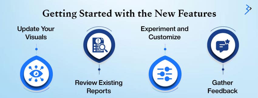
6. Getting Started with the New Features

To fully benefit from the latest ZoomCharts updates in Power BI, follow these steps:
- Update Your Visuals: Visit the Microsoft Azure or ZoomCharts website to download the latest version of your visuals.
- Review Existing Reports: Revisit your dashboards to identify opportunities for improvement. Longer axis labels, refined tooltips, and organized map shapes can enhance your current reports.
- Experiment and Customize: Test the new shape layers, rename link categories, and explore fresh formatting options. Tailor the visuals to align with your brand’s aesthetic and narrative.
- Gather Feedback: Share your updated visuals with your team and gather insights on clarity and usability. Small adjustments, such as clearer labels or enhanced tooltips, can significantly improve customer user experience.
These steps will ensure you’re leveraging the full potential of the latest updates, optimizing your reports, and creating a smoother, more impactful data visualization process.
ZoomCharts Revolutionizes Power BI Visuals in 2025
ZoomCharts continues to push the boundaries of what’s possible in Power BI visualizations with its February 2025 update. Whether you’re building detailed business dashboards, conducting geographic analysis, or mapping complex relationships, these new features—extended axis labels, shape layer control in maps, and customizable link categories—empower users with greater clarity, control, and customization.
As data becomes more complex, intuitive visual tools like those offered by ZoomCharts are essential for uncovering insights and driving smarter decisions. With each update, ZoomCharts reinforces its commitment to enhancing the user experience, making Power BI not just a reporting tool but a dynamic storytelling platform.
Read More – Personalized Data Experiences with Power BI Reports for Multiple Metaverse Avatars
FAQs
Extended axis labels ensure that long category names are fully visible, improving readability and data clarity without manual workarounds like abbreviations or tooltips.
Simply right-click on a lasso-drawn shape and choose the “Shape Layer” option to assign it to a specific layer, helping you manage shape visibility and styling.
Yes. The new update allows you to define custom display names for each link category, which will appear in the legend and improve the interpretability of complex graphs.
Shape layers are custom groupings of drawn shapes that can be styled individually and shown or hidden at specific zoom levels, offering more flexible mapping options.
Yes. A new setting allows users to automatically hide empty values in tooltips, which results in cleaner, more relevant tooltips for end users.
You can download the most recent versions of ZoomCharts visuals from Microsoft AppSource or directly from the ZoomCharts website under their Power BI custom visuals section.
Related Articles
-
How to Drive Success Leveraging Odoo ERP, Business Intelligence, and Data Analytics
Data analysis has become central to determining the best decision-making. But today, companies need an automated system to organize data at scale. ERP and BI are integrated and can be
-
Paginated Reports In Power BI – All You Need To Know
Microsoft’s all-inclusive Business Intelligence (BI) Suite has a lot to offer. Expanding the power of SQL Server along with SSAS, SSIS, and SSRS, Microsoft is known to be the most
-
Power BI Consulting Services – MS Excel Power BI Data Types
The Progress of Excel There is no doubt that presently Excel has evolved to become the ultimate decision-making application. It allows to leverage the flexibility of the two-dimensional grid and


