About
With more than 85 years of history and a team bigger than many cities in Brazil, the client believes that a better future will demand quality food. They have a vivid, long, and complex chain requiring sustainable management. Sustainable to ensure the development of their employees, partners, clients, and consumers alike.
Sustainable management allows them to respect the environment and animal welfare and fosters business growth to create and share value with all our chain members. They believe that only then will the client be able to take responsibility for the results and offer quality food.
Project Highlights
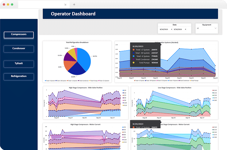
Brainvire’s team created thumbnails under specific headings and subheadings using icons in the Finance dashboard. They also provided tooltips for additional information like the name of the workspace or profile details. The icons were associated with embedded URLs to navigate to the respective report. In the Lizard Utilities dashboard, the team created visualizations to display the temperature, pressure, and energy consumption of different equipment and their sensors. It enabled the user to navigate through the pages using the side navigation bar and filter the data for the date range selection provided in the slicer.
The Challenges
- Single Value Column:Different sensors have different data types, but there was only one value column for all the sensors.
- Data Setting:Setting up the data on the graphs based on the different time intervals.
- Data Filtering:A single date range slicer is used to filter data for the sensors present in different tables.
- Displaying Dynamic Legends:Dynamic Legends are to be displayed on the visuals as per the selection in the sensor slicer.
Tech Stack
Power BI
Azure DevOps
Data Lake
Result
Values Displayed on the Y-Axis
Creating duplicate columns for different sensors enabled the client to display values on the Y-axis based on their respective calculations using a single table and getting filtered out using the slicer.Distinct and Clear Values
Converting the date column from date/time to date format helped display values on the y-axis more distinctly while the values on the x-axis are present with an interval of 1 day.Single Slicer for Multiple Sensor Values
Relationship between the calendar table and other tables of different sensors enabled filtering data in the visuals using a single slicer with date range selection for multiple sensor values.Legends Name Altered
Creating a DAX query helped alter the legends’ names in the visuals based on the selection of the sensor name, providing detailed data for the client.
