Power BI Visuals: Browse Interactive And Appealing Chart Data Visualizations
-

Pratik Roy

Business intelligence (BI) solutions provide evidence based on accumulated data to enable better decision-making. Access to information has been democratized recently and is no longer restricted to upper-level management.

As a result, business intelligence (BI) technologies are being used at all levels of a business to delve into the data required for decision-making. This allows customers to benefit from the various features of BI tools, like generating reports and dashboards, without having to learn to code.
Business Intelligence Visualization tools are thus often used by businesses to get insights from their data. Power BI is one of the most excellent visualization tools to manage the data in various patterns and make observations.
Data visualization is an integral aspect of the data science process that may be used to control the exponential growth of available data. In 2023, you can easily handle massive amounts of data by using a variety of Power BI graphics or chart styles.
What Is Power BI?
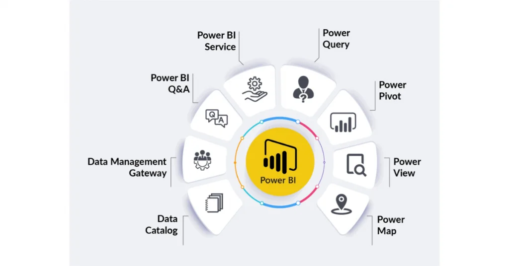
Microsoft says Power BI is based on an application framework containing tools and software applications that combine to create an integrated and unified view of your unrelated data sources. For example, data may be a spreadsheet or a mix of cloud or in-premise hybrid data warehouse.
PowerBI experts collect complex and diverse data and distill it into a simple dashboard that helps you identify patterns and trends. This will enable companies to be decisive about the measures that matter the most while improving on the key metrics. PowerBI consultants create visual dashboards that any department can use.
PowerBI software is designed to easily access data sources, visualize and find what is important, and share it with everyone.
Visualizations Types In Power BI
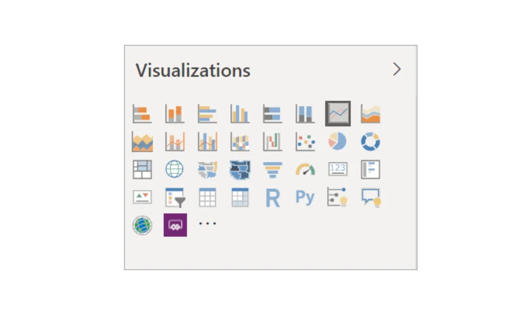
Power BI allows users to pin dashboards, specify visuals in Q&A, and embed interactive data visualizations directly into reports. Power BI charts are the most common, generally used, and user-friendly visualization option for dashboards and reports. Because of their adaptability and interactivity, these charts may be seen from various angles. Partnering with an AEM development solution company can further enhance data visualization and content management, ensuring seamless integration with business intelligence tools. To gain a new understanding and answer further questions about your data, try using a variety of graphics in your reports.
Area Charts
This simple chart illustrates a relationship between three variables. Line charts provide the basis for this kind of graph, which shows the amount of change over time and numerical data. In between the axis and the line in this chart is a riot of color and design.
An area chart, for instance, might be used to demonstrate a profit over time by showing the trend’s aggregate fluctuations.
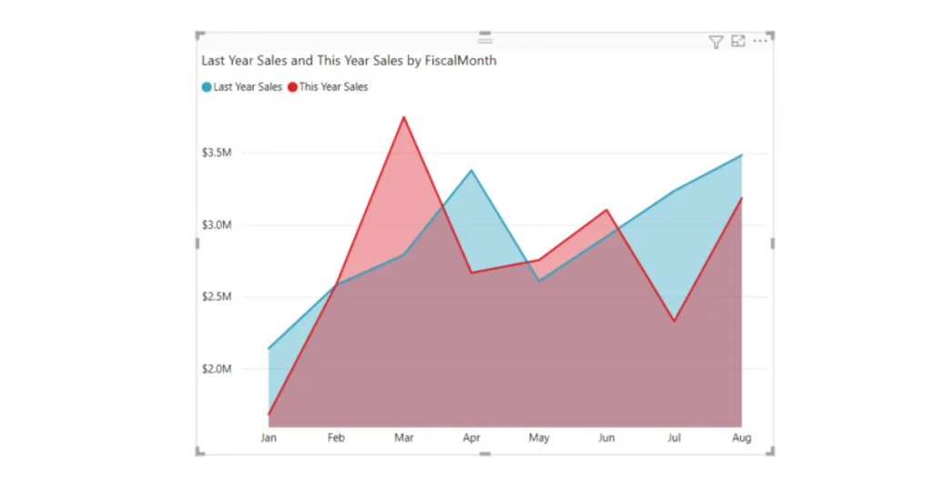
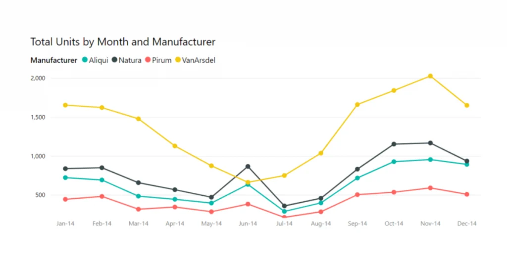
Line Charts
In line charts, we can see how values have evolved. The data is shown as a sequence of dots linked together by lines. Line charts have the Y and X-axis to display values on both sides. It’s one of the easiest-to-understand, most widely-used charts for illustrating how values have evolved through time.
A line chart is a basic graph that connects data points (represented by dots) through time to illustrate trends via a straight line.
â€For example, a line chart represents the monthly revenue for the financial year.
Bar & Column Charts
Power BI developers often use bar and column charts to highlight outliers and trends across several categories.
Bar Charts are fantastic Power BI Charts that enable users to represent the absolute value of the data. In addition, column charts are used to compare the same data by constructing certain groupings and comparing those clusters.
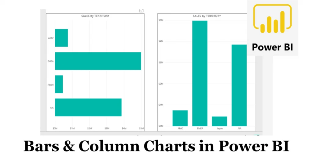
A horizontal bar or column chart may show positive and negative values on the left and right sides of the axis, respectively. Solid bars represent a single data value stretch to the chart’s origin.
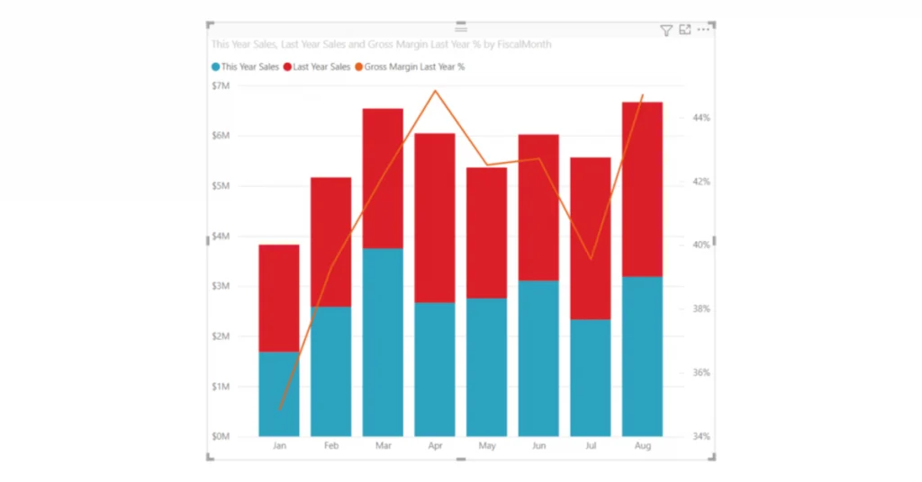
Combo Charts
A Combo chart is a hybrid of the more common column and line charts. Combining the two charts into one allows you to compare the data quickly. It’s essential to pay attention since combo charts may have either one or two Y axes.
Here is why you need to use combo charts:
- When the line chart and a column chart use the same X axis.
- To evaluate many metrics using the same set of values.
- To visualize the relationship between two metrics.
- The process of determining whether a given metric has achieved a predetermined goal.
- Reduce the amount of blank canvas used.
Pie Charts
Pie charts help illustrate how various components contribute to the overall segment. Statistics are depicted as segments or divisions in these circular charts. For example, a perfect Pie Chart would have 100 elements, where each segment represented a fixed proportion of the whole.
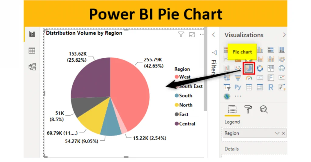
Users may plot data belonging to the same category using a pie chart, where each “slice” represents a different number or percentage. Categorical information, such as market share, proportionate data, etc., may be plotted most effectively.
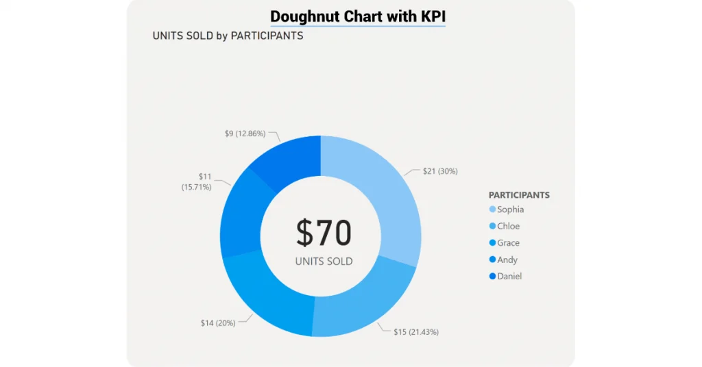
Doughnut Charts
Users of Power BI may use the Doughnut Chart to display data that spans several categories. It’s essentially identical to Pie Charts, except that it’s hollow in the middle like a doughnut and has room for you to identify the categories and their respective percentage shares. Doughnut charts have all the other characteristics of pie charts.
Doughnut charts excel in displaying data distributions, such as the distribution of sales across different product types. The donut visually represents this breakdown while providing structural integrity for the supplementary dollar and percentage values.
Examples include a breakdown of the overall number of participants by name.
Gauge Charts
One value representing development toward an objective or key performance indicator is plotted on a circular arc in a radial gauge chart. The line represents the target or intended value (needle). The shade indicates the degree to which we have progressed toward this target. The advancing value is highlighted in bold inside the arc to emphasize its significance. The range of values, from lowest to highest, is represented by a continuous curve.
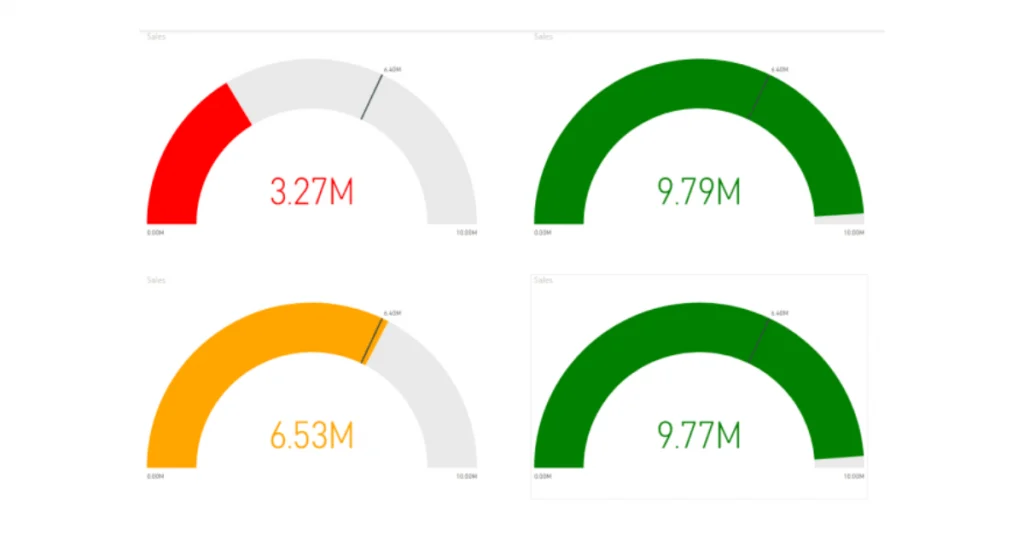
The use of radial gauges is recommended for the following purposes:
- Make visible progress toward an objective.
- Imitate a key performance indicator’s percentile metric.
- Display the status of a single metric.
- Exhibit data in a manner that may be rapidly read and comprehended.
Funnel Charts
A funnel is a useful tool for visualizing a multi-step process in which inputs are processed in a predetermined order. A lead generation to order fulfillment sales process is one such example.
An applicant’s progress through a funnel may look something like this:
This is a lead, not a qualified lead, not a prospect, not a contract, not a close.
The visual representation of a funnel’s health provides instant feedback on the status of the monitored process. Each tier of the funnel stands for a certain fraction of the whole. Therefore, a funnel chart often has the general form of a funnel, with the first stage being the biggest and the successive stages becoming progressively smaller. Another helpful tool is a pear-shaped funnel, which may reveal underlying issues. However, the “intake” stage, which occurs first, is often the greatest.
PowerBI Data Import Data Sources
Discover the potential of Power BI in creating impactful visualizations that yield valuable insights. Regrettably, not everyone can offer the expert assistance required for efficient data extraction. That’s why partnering with a certified Microsoft partner for Power BI consulting services is a prudent decision.
Data Modelling
It involves transforming your data into something more useful than simply raw versions. Power Bi’s revolutionary Power Pivot helps on that front. If you can develop your knowledge using Power Pivot, you can become a professional PowerBI expert.
Acquisition Of Data
This means you can connect your data wherever you are and build your PowerBI solution according to your needs.
How Will Power BI Consulting Services Help You?
Let PowerBI help you with a professional consultancy program. Then, you can trust our experts at every stage of the implementation we support.
You can also hire several PowerBI consultants along with the whole project process. Use the pay-per-use model—PowerBI consultant services.
PowerBI Interactive Dashboards
PowerBI Integrated Dashboard allows users to monitor key business metrics at once, easily. Your dashboard may incorporate different data sources and display key insights to an attractive visual audience. In addition, the dashboards combine cloud and in-house data to offer consolidated data visibility.
It is not only visually attractive but also interactive. No matter how many people are involved in the company’s management, our teams have created a dashboard to fit every situation. The data can then be accessed by any person and shared with others.
PowerBI Licenses
Users can connect to data sources, conduct analyses, and generate reports for free using Power BI Free / Desktop. This license is intended for single users who need to access the reports alone and have no intention of sharing them with others.
Use Performance Analyzer Tool
Whenever a user does anything that causes the system to execute a query, the performance analyzer clocks how long it takes to complete the update, including the time it takes to build or update a graphic. When making changes to a slicer, for instance, the slicer visual must be changed, a query must be issued to the data model, and all impacted visuals must be refreshed.
PowerBI Use Cases
Microsoft Enterprise Services is an effective business intelligence product specializing in Visualization and can help you address the issue related to web, Mobile, and Cloud Application development. In addition, Microsoft Power BI is a foundational programming framework for businesses with huge volumes of diverse data created during routine business activities. Therefore, power BI has several purposes in constructing a software system.
Wrap Up!
Power BI is undoubtedly a wonderful solution for business intelligence tools that enable users to harness data to create data-driven choices. However, if you want your company to expand strategically based on data-informed choices, it is not enough to manage its data. Data is no longer just a need for running a company; it is the essential lifeblood of the enterprise.
Power BI, Tableau, Qlik, Looker, and many more are just a few of the technologies available for visualizing data. In addition, the Power BI software is intuitive and simple to master. As a result, users with technical expertise may use data for better decision-making. Power BI is one of the most well-liked business intelligence (BI) products available today for several reasons, including its self-service BI features, compatibility with a wide variety of data sources, and robust community.
FAQs
Due to the breadth of Power BI’s visual capabilities, it would be easier to provide a specific recommendation after learning more about your requirements. Images from the text may be picked and chosen as needed.
You may remove the field that Power BI Desktop is sorting on as a workaround to clear the sort.
– Add a new dimension to the chart
– Pick the new field to sort by
– You may sort the list either alphabetically or descendingly
Power BI reports and other dashboards cannot import dashboard visualizations. Here’s what you can do about it.
– To see a visualization, open a report that contains at least one.
– Copy the visualization by selecting it and then paste it somewhere in the doc.
Personal dashboards in your model-driven software may benefit from including Power BI graphics by doing the following. Settings > Administration > System Settings > Reporting tab > Allow Power BI visualization embedding will activate Power BI visualizations for your business.
Power BI visuals may be imported or expanded using AppSource.
– Launch Power BI Desktop or the Power BI service and access your report.
– Make use of the ellipsis by clicking it in the visualizations menu.
– Click the menu item to get more images.
– Select Visuals from AppSource, then choose the desired image to import.
– To include the image in your report, click the Add button.
Power BI includes several built-in data visualization tools, including charts, maps, and graphs. Furthermore, it has intricate models such as waterfalls, gauge charts, and funnels.
Related Articles
-
 A Step-by-Step Guide to Building a Power BI Interactive Dashboard
In today’s data-driven ecosystem, the way organizations perceive and leverage data defines their ability to adapt, innovate, and lead. Simply collecting data is no longer enough—extracting actionable insights through compelling
-
Microsoft SharePoint 2019: What’s new?
Ever since Microsoft launched its web-based collaborative platform SharePoint in 2001, there has been constant innovation in the process. The latest unveiling is that of the SharePoint Server 2019, which
-
 Uncover how the right Applications and Strategies will help Insurance Companies in adapting to the New Standards
The Covid-19 spike made Insurance companies realize that they need to adopt new applications and strategies to unleash their reputation and nurture their customers. Though insurance companies were built keeping