Mastering Data Visualization with Power BI
-

Pratik Roy

In the age of data, insight is the ultimate competitive edge. Whether you’re steering business strategy or streamlining operations, the ability to transform complex datasets into clear, actionable visuals can spell the difference between informed decisions and guesswork. That’s where Power BI steps in—a powerful business analytics tool by Microsoft that empowers users to visualize their data, uncover hidden trends, and tell compelling stories through interactive dashboards.
But Power BI isn’t just about dragging and dropping charts on a canvas. Mastering Power BI means diving deep into data modeling, crafting intuitive dashboards, writing advanced DAX expressions, implementing row-level security, and adopting best practices to ensure your insights make the impact they deserve.
In this comprehensive guide, we’ll explore everything you need to truly harness the power of Power BI—from fundamentals to pro-level strategies.
1. Understanding the Power BI Ecosystem
Before jumping into charts and filters, it’s essential to understand what makes up Power BI. The Power BI ecosystem comprises the following:
| Component | Description |
| Power BI Desktop | The main development environment used to create data models and visual reports. |
| Power BI Service | A cloud-based platform to publish, share, and collaborate on Power BI reports. |
| Power BI Mobile | Mobile apps for iOS and Android to view dashboards and reports on the go. |
| Power BI Gateway | Facilitates data changes by linking on-premises sources to Power BI Service. |
| Power BI Report Server | Hosts Power BI reports for safe access in an on-premises environment. |
Together, they form a robust end-to-end BI platform that scales from individual analysts to enterprise-wide deployment.
2. The Art of Data Modeling
A thoughtfully crafted data model is at the heart of every successful Power BI project. Think of the data model as the blueprint of your insights—it determines how efficiently data is processed, how accurately your calculations are performed, and how smoothly users interact with your reports. A robust data model doesn’t just support performance; it also enhances scalability and ensures that insights remain trustworthy as your data grows.
Gaining these skills through a Power BI course free with certificate can help you apply best practices and build impactful, efficient models
Star vs Snowflake Schema
One of the first structural decisions in Power BI modeling is choosing between a star schema and a snowflake schema. The star schema is highly recommended for Power BI because it simplifies table relationships and enhances performance. In this schema, a central fact table, which contains measurable data like sales or revenue—is surrounded by dimension tables that describe entities such as products, customers, or time. This layout supports faster DAX (Data Analysis Expressions) calculations and more straightforward navigation when building reports.
On the other hand, the snowflake schema normalizes dimension tables into multiple related sub-tables. While this reduces data redundancy and storage space, it increases the complexity of relationships. In Power BI, this complexity can slow performance and complicate report development, making the snowflake schema a less favorable choice unless necessary.
Relationships and Cardinality
Power BI allows you to define relationships between tables based on primary and foreign keys. Understanding cardinality—the nature of the relationship between two tables—is essential for accurate data aggregation and filtering. Common types include:
- One-to-many (1:*): Most common and preferred for Power BI, such as one customer with many orders.
- Many-to-one (*:1): Conceptually similar but requires attention to filter direction.
- One-to-one (1:1): Used sparingly and often in cases where entities are split across tables.
- Many-to-many (:): Can introduce ambiguity and performance issues; should be used cautiously with bridge tables if needed.
Correctly defining these relationships ensures that filters, slicers, and measures work as expected, avoiding incorrect or unexpected results.
[ Read More: Harnessing Data Insights: Power BI’s Impact on the Energy Industry ]
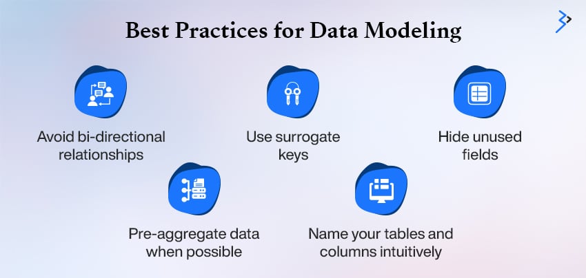
Best Practices for Data Modeling
To make your Power BI model clean, efficient, and easy to maintain, consider these best practices:
- Avoid bi-directional relationships unless necessary, as they can lead to circular dependency errors and degrade performance.
- Use surrogate keys instead of natural keys to ensure consistency and simplify relationships, especially when dealing with composite or multi-column keys.
- Hide unused fields to declutter your model and streamline report-building for end users. Keeping only relevant fields visible ensures focus and improves the usability of your reports.
- Pre-aggregate data when possible, to reduce processing time and enhance performance.
- Name your tables and columns intuitively so others can easily understand the data structure without digging into metadata.
By following these principles, your data model becomes more than just a technical layer—it becomes the strategic backbone of your analytics solution.
3. Transforming Data with Power Query
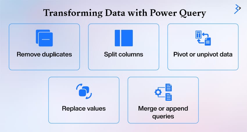
Data often needs to be cleaned, shaped, and prepared before a data model is built in Power BI—and that’s where Power Query shines. It offers a user-friendly interface backed by the powerful M language, enabling users to perform complex data transformations without writing code.
With Power Query, you can easily:
- Remove duplicates to ensure data integrity
- Split columns for better structure and analysis
- Pivot or unpivot data to change the layout for reporting needs
- Replace values to standardize or clean up datasets
- Merge or append queries for combining data from multiple sources
Power Query follows a step-by-step applied transformation model, allowing you to track every change made to your data. This makes debugging errors easier, helps understand the flow, and provides logic to be updated. Each transformation step is recorded and can be reordered or edited anytime.
Pro tip: Apply as many transformations as possible at the source level—before data is loaded into Power BI. This approach enhances performance by reducing the workload during report generation and ensures a smoother user experience. Power Query is the bridge between raw data and insightful visuals.
4. Designing with Purpose: Visualization Best Practices
Power BI offers a vast array of charts, maps, KPIs, and custom visuals, but too many can create clutter and confusion. Effective design guides the viewer’s attention and delivers insights clearly.
Key Principles include:
- Clarity over creativity: Prioritize readability and usefulness over decorative elements.
- Tell a story: Design visuals to answer specific business questions.
- Use color intentionally: Highlight key data points without overwhelming the viewer.
- Minimize distractions: Skip 3D charts, excess labels, and noisy backgrounds.

Essential Visuals to include:
- Bar/Column Charts: Best for side-by-side comparisons
- Line Charts: Great for showing trends over time
- Maps: Ideal for geographic data analysis
- Matrix and Tables: Help in detailed data inspection
- Gauges and Cards: Effective for displaying KPIs and quick summaries
Design with purpose to ensure your reports are both insightful and easy to navigate.
[ Read More: Personalized Data Experiences with Power BI Reports for Multiple Metaverse Avatars ]
5. Creating Interactive Dashboards
A static report might inform, but an interactive dashboard engages. Interactivity in Power BI transforms data into a two-way conversation.
| Feature | Description |
| Slicers and Filters | Slicers offer intuitive filter controls—checkboxes, dropdowns, and date sliders. |
| Sync Slicers | Use across multiple pages to maintain a consistent filtering experience. |
| Filter Levels | Applying filters at the visual, page, or report level depends on the required scope. |
| Drillthrough | Allows users to click through to detailed pages for more profound insights from summary visuals. |
| Custom Tooltips | Display additional context or metrics when hovering over visuals. |
| Bookmarks | Save specific views or states of a report to guide users or create interactive reports. |
| Buttons | Link buttons to bookmarks for navigation, view toggling, or filter resetting. |
6. Harnessing the Power of DAX
Data Analysis Expressions (DAX) is the formula language in Power BI. It allows you to create calculated columns, measures, and tables that add depth and intelligence to your data.
Common DAX Functions
- CALCULATE() – The king of context manipulation.
- FILTER() – Refines a table based on conditions.
- SUMX() – Iterative calculations over tables.
- RELATED() – Brings values from a related table.
- ALL() – Removes filters from a context.
Example:
Total Sales = CALCULATE(SUM(Sales[Amount]), FILTER(Sales, Sales[Region] = “East”))
This formula dynamically sums sales only for the East region, regardless of slicer selections.
Tips for DAX Mastery
- Understand row context vs filter context
- Use measure tables to organize calculations
- Test with small data samples before scaling
7. Implementing Row-Level Security (RLS)
In Power BI, Row-Level Security (RLS) ensures that users only see the data they are authorized to view. This is essential for protecting sensitive information and tailoring insights to specific organizational roles or departments.
Setting up RLS starts in Power BI Desktop. Under the Modeling tab, you can create roles and define DAX filters to control access. For example, a filter like:
[Region] = USERNAME()
It restricts data so users only see rows where the region matches their username. These filters are applied at the data model level, ensuring consistent security across all reports and visuals.
Once the roles are created, publish the report to the Power BI Service and assign users to the corresponding roles. This ensures that users only access data relevant to their role when they open the report.
For larger organizations, Dynamic RLS offers a scalable solution. Instead of creating multiple roles, you define one that dynamically adjusts based on the logged-in user’s credentials. This approach is easier to manage and reduces administrative overhead while maintaining robust data protection.
Implementing RLS is crucial in building secure, role-sensitive Power BI reports and dashboards.
8. Sharing Insights Across Your Organization
Once your report is polished and secured, sharing the insight is time-consuming.
Options for Sharing
- Publish to Web – This is for public sharing (be cautious with sensitive data)
- Power BI Service App Workspaces – Ideal for team collaboration
- Power BI Apps – Bundle reports/dashboards and distribute across departments
- Export to PDF/PPT – Great for static presentations
Embed Power BI
Using Power BI Embedded, you can embed Power BI visuals into your internal applications, enabling users to view reports and perform data visualization using Power BI without switching platforms.
9. Performance Optimization Tips
As datasets grow, performance becomes key. Here’s how to keep your reports lightning-fast:
| Tip | Description |
| Use Import Mode | Prefer Import over DirectQuery for better performance and faster load times. |
| Reduce Data Volume | Filter out unused rows and columns to streamline the dataset. |
| Simplify Visuals | Avoid complex visuals like deeply nested hierarchies that slow down rendering. |
| Minimize Calculated Columns | Use calculated columns sparingly in large tables to reduce processing load. |
| Use Aggregated Tables | Create pre-summarized tables to speed up report loading and queries. |
| Performance Analyzer | Use this tool in Power BI Desktop to pinpoint slow visuals and DAX bottlenecks. |

10. Real-World Use Cases of Power BI
Power BI isn’t just a reporting tool—it’s a business enabler across industries. Here’s how different sectors leverage Power BI to drive insights and decisions:
Retail
Retail businesses use Power BI to track sales across multiple stores, with the ability to drill down into product categories, periods, and regional performance. With row-level security (RLS), store managers only see data relevant to their location. This localized insight helps drive targeted decisions, optimize inventory, and boost sales performance.
Healthcare
Hospitals and healthcare providers use Power BI dashboards to monitor key metrics such as patient outcomes, treatment effectiveness, and wait times. These insights improve service quality and operational efficiency. Implementing RLS ensures that sensitive patient data remains confidential, aligning with HIPAA and other data privacy standards.
Finance
Power BI helps finance teams visualize profit and loss, track cash flow, and monitor KPIs in real time. With DAX-powered trendlines and forecasting, they can project future revenue and spot financial risks early. This proactive approach supports strategic planning and improves budget management.
HR
Human resources departments use Power BI to track hiring metrics, monitor diversity and inclusion progress, and analyze employee satisfaction survey data. These dashboards help leadership make data-informed recruitment, retention, and workforce well-being decisions. HR maintains confidentiality while promoting transparency by sharing insights securely at the department level.
Power BI empowers organizations to transform raw data into actionable intelligence, securely and efficiently delivering tailored insights to the right people.
11. Continuous Learning and Community Support
Power BI is evolving fast. Microsoft regularly rolls out new features—like copilot, natural language Q&A, and dataflows.
Stay sharp by tapping into:
- Power BI Documentation
- Power BI Community
- Microsoft Learn
- Power BI YouTube Channel and blog
12. Final Thoughts: From Data to Decisions
Mastering Power BI isn’t about knowing every function—it’s about learning how to think with data. With the right foundation in modeling, smart use of visuals, interactive design, secure sharing, and performance tuning, you can elevate your reports from informative to transformative.
Power BI empowers professionals across roles—analysts, managers, and executives—to stop reacting and start anticipating. Whether you’re uncovering bottlenecks, forecasting revenue, or telling a story to your board of directors, Power BI puts the full power of insight into your hands.
Related Articles
-
 Benefits of SharePoint Intranet for Financial Institutions
SharePoint is a system that may help companies of any size deal with a wide range of operational difficulties. Document management is the first thing that comes to mind when
-
 Data Fabric vs. Data Lake: Which Architecture is Right for Your Data Management Strategy?
Data is everywhere—flowing in from apps, websites, sensors, and countless business systems. For enterprises, this means more than just storage headaches; it’s about making that data work for the business.
-
 The Microsoft Power Platform – Empowering Millions of People to Achieve more
By 2023, 500 million apps will be developed to drive organizational transformation and productivity. Microsoft is at the forefront of this digital transformation, aiming to assist businesses to reimagine how