7 Ecommerce Websites for Your Inspiration for Design Success
-

Hiren Raval


Over 50 milliseconds have passed since the moment you clicked on this link, and visitors have developed an opinion about your ecommerce website in that fraction of a second.
88% of online consumers are less likely to return to a site after a bad experience.
The first impression is lasting and crucial to navigating through their experience with you as a business – so are YOU confident in what they see?
The idea that creating an ecommerce website is simple and without risks might be one of the most prevalent myths in the online world today.
People form an opinion about your website in 50 milliseconds. If it doesn’t look good, then they won’t be able to stay for very long and will most likely leave after giving off a few seconds of their time at most!
In order to stand out in the crowd, businesses need to focus on user experience, which will lead them to create fresh eCommerce website designs. Undoubtedly, eCommerce websites have been growing exponentially within the last decade. Many businesses have been taking advantage of this trend, and now there are more than 3 million ecommerce websites worldwide.
However, there is a limitation for all these new ventures because only about 5% of these work really well. Furthermore, search engines only index around 10% of the product pages across the web and don’t rank those effectively in search results which means visitors can easily find their way to your competitor’s website first before they get a chance to visit yours.
If so, what makes an ecommerce website effective? And how can website design affect your bottom line?
No worries, we’ve compiled the following list of features as well as ecommerce website design tips from industry experts for achieving website excellence:
1. Think About the First Page Experience
The website design should be focused on the website visitor’s first impression of your website. Then, the web design can be done so that website visitors will feel comfortable enough to stay and continue browsing your website. One example would be to focus on simplicity and ease of use so website visitors won’t have any problems finding relevant information on your website.
57% of internet users say they won’t recommend an online business with a poorly designed website on mobile.
2. Optimize the Homepage and Landing Pages for Search engine optimization
Your ecommerce website design should be coded in a search-engine-friendly way so website visitors can find you by searching on Google or Bing. Make sure to do keyword research and include those keywords throughout your website design, including titles, meta descriptions, and alt text. While website visitors should be engaged, website design is still essential for eCommerce website development.
3. Make Sure Content is Accessible and Mobile-friendly
Nearly half of all website traffic comes from mobile devices like smartphones and tablets, so website designers must make their websites accessible across different devices. It also means designing for smaller screens, making content accessibility even more critical because there isn’t any room for irrelevant content or high-quality photos that may otherwise distract website visitors.
4. Utilize Social Proof to Increase Conversions
Including social media widgets on website design is a great way website designers can increase website conversions by leveraging the trust associated with social media profiles and websites like Facebook, Twitter, and LinkedIn. One example would be including a “People Who Bought This Also Bought” widget below each product in an online store. It increases website confidence and website conversions in one fell swoop.
Social media integration can also encourage people to share their favorite content on social media. If done correctly, website visitors will be more motivated to share content because of the visual appeal of the website design itself.
5. Design for the Data-Driven Experience
The website should be built, so that website visitors don’t have to navigate from page to page to find what they are looking for. The best website designs plan ahead from inception when it comes time for coding the website. Goals and website analytics should be included in website design so website designers can understand what website visitors want and how they want it served to them.
38% of people will stop engaging with a website if the content or layout is unattractive.
6. Keep it Focused and Uncluttered
The ecommerce website design should be simple and easy to navigate so website visitors can find their way around the website without any hassle. It also means focusing only on important website content, such as website CTAs and website features designed to increase conversions like contact forms that you can create with IvyForms or online signup buttons. Less is more when it comes to website designs, especially with the number of distractions online stores have these days.
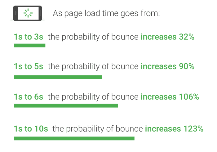
7. Make Sure Images are Optimized for Search Engines
39% of people will stop engaging with a website if images won’t load or take too long to load
Images play a big part in website design because they help engage website visitors and create trust between your brand and website visitors. However, make sure to include “Alt tags” on each image as well as use high-quality product images.
8. Include Video – Short and Long Form
Video is powerful, and website visitors enjoy engaging with video on websites. It keeps website visitors on your website longer and has a high conversion rate. You can include video in your website design both within the website and on landing pages. No matter where you include it, ensure that it’s valuable and not just an advertisement for your ecommerce business.
So from the above information, it’s pretty clear that business owners must consider how a site should perform for customers using more advanced devices with different screen sizes and resolutions.
[Also read: 7 Ways To Take Your B2B eCommerce Store To The Next Level]
External factors such as colors and imagery also contribute to the overall design of an ecommerce site.
However, to understand these components in greater detail, we’ve assembled a list of some of the key differences between B2C and B2B websites and how each appeals to its respective customer:
Let’s explore some factors that differentiate the customer experience at B2B and B2C websites
1. Customer Intent
B2C websites are typically aimed at consumers in the market to purchase products that enhance their personal life.
The goal is to help users decide which product best suits their needs—be it an action camera or digital piano—and then point them in the direction of retailers selling that specific item. Therefore, the site should be well-organized and allow visitors to filter results by price range, customer rating, customer reviews, etc., without digging through pages of results.
On the other hand, B2B websites are built keeping business owners in mind. These users are looking for products that solve their problems, so the website’s overall design should provide enough product information to make an informed decision before purchasing.
Business owners don’t typically have long buying cycles (compared to consumers). They need content like pricing information up-front.
Industry leaders recommend including a “buy” button early in the sales funnel if you’re selling a service or license. This gives customers something secure and easy to buy into, even if they haven’t entirely pulled the trigger yet. Then, once they’re wearing the “shoes” of your business, they can explore additional content for more information about how it works or solve their pain points.
2. Purchase Process
The app and site experience for B2C and B2B sites are different due to the nature of the customer intent. B2C customers typically go directly to a product page or view an item on a retailer’s website before purchasing. There’s usually just one set of pages they need to go through to buy something, such as adding an item into their online cart then checking out.
Meanwhile B2B customers expect to see more pages in the shopping process, including detailed product information before purchasing. This is because B2B customers are not typically in the market for buying one item; they want to learn more about your product or service’s benefits and how it can help them solve their business problems.
3. User Experience
B2C companies usually place less emphasis on their homepage because they know that customers will be exploring different sections of their site in search of specific products or information. This is why B2C websites must be user-friendly.
However, B2B companies often view their homepage as the most important page of their website because this is where they introduce themselves and establish an initial connection with potential customers. Business owners must also consider how users will interact on each page of their site to ensure that they provide all necessary information without overwhelming them with too much content. With so many different products available for sale on B2B sites, owners can’t afford to lose potential buyers’ interest at any stage of the purchasing process.
Both B2C and B2B companies need to incorporate an efficient navigation system into their ecommerce sites, but this is especially true for B2B websites since there’s a greater chance that users won’t be familiar with the company they’re buying from.
Having an easy-to-use navigation system will guide those unfamiliar visitors through your site and help them understand how to use it. As a result, you’ll see more qualified leads and conversions due to faster and more accessible navigation.
Now that you know how B2B ecommerce web design differs from B2C let’s look at some great website designs in the industry.
7 Best Ecommerce Website Design Examples
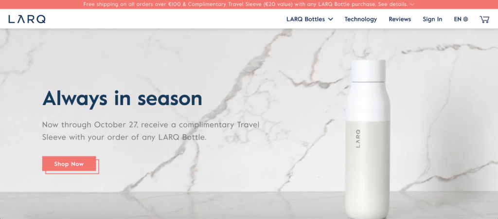
1. Larq
LARQ shows pictures, videos, and animations of their products to give you a more immersive experience. The store’s focus on the Bottle Movement is through its spot-on copywriting, color-block product features, and interactive plastic waste calculator. They also offer various stylish products that consumers are encouraged to explore.
LARQ saw their conversions go up over 80% after adding multi-regional support.
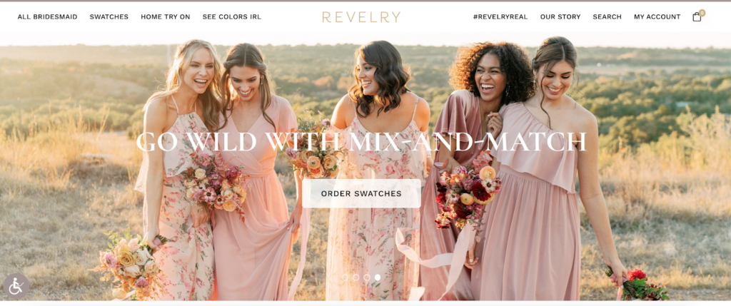
2. Revelry
Revelry knows that a swatch is a perfect way to decide when the hard choices quickly become about the bridesmaids’ dresses. So the store offers free delivery for your ends and at-home try-on. There’s also lots of navigation, including categories highlighting different dress styles, materials, and colors. Plus, there are helpful videos of how to find the right size.
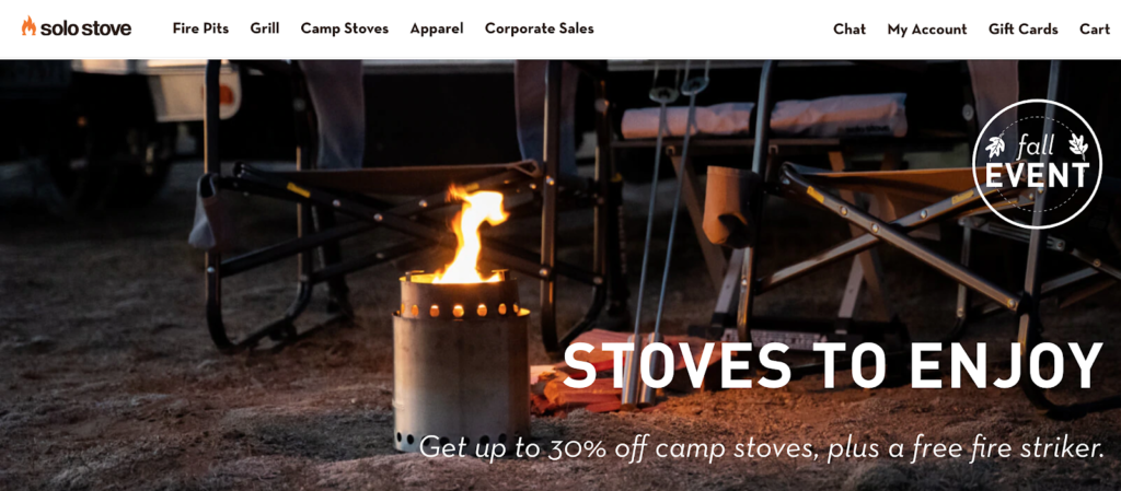
3. Solo Stove
Solo Stove has done a great job of using imagery on their website. The company has created icons for each category, so it’s easy to see what you’re browsing, and they’ve also highlighted some key features of the product with images. In addition, how-to videos, artwork, and FAQ sections often help customers better understand the products’ features and benefits. As such, consumers will be convinced that their purchase is worth it as they see that these products are durable, easy-to-use, and offer great value for money as customers can read unbiased reviews from those who have already purchased these items.
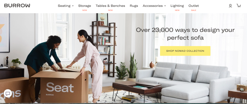
4. Burrow
The modular furniture retailer Burrow features a video on its homepage to drive the point home that assembling new furniture can be fun, quick, and tool-less. Burrow’s newest images of products and lifestyle shots will help you imagine what the new designs will look like at home, show you how you can customize for your very own fit, and place an order in just a few clicks.
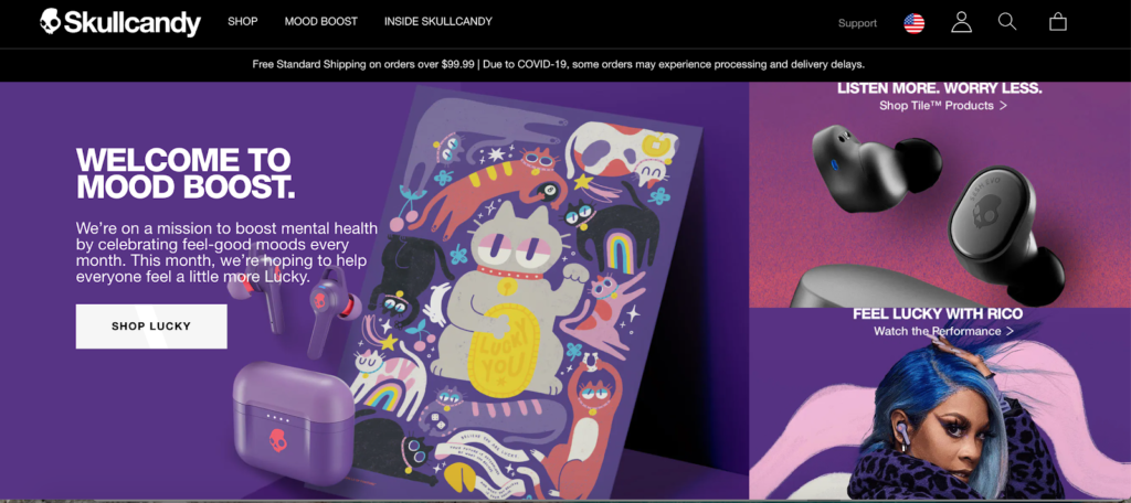
5. Skullcandy
Skullcandy has been making waves in the past few years. They expertly combine sleek, modern website design with classic colors to give you that luxury feeling. Brilliant visuals and design on their website mean users can discover, review, video, and read all about their products. Their primary market is audio, but Skullcandy also has something for everyone. You can find it all on the specs page.
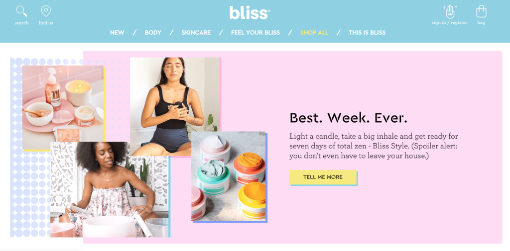
6. Bliss
Bliss’ website is so cute! They use three bright colors – Millennial pink, baby blue, and Gen Z yellow to create a beautiful multimedia experience. These colors are oriented towards the types of people who buy their products. The “funky and friendly” brand attitude is also clear in the microcopy. For example, button copy, section titles, and form descriptions use language that feels like you’re talking to your friend about skincare.
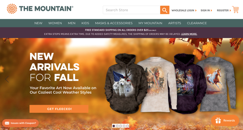
7 . The Mountain
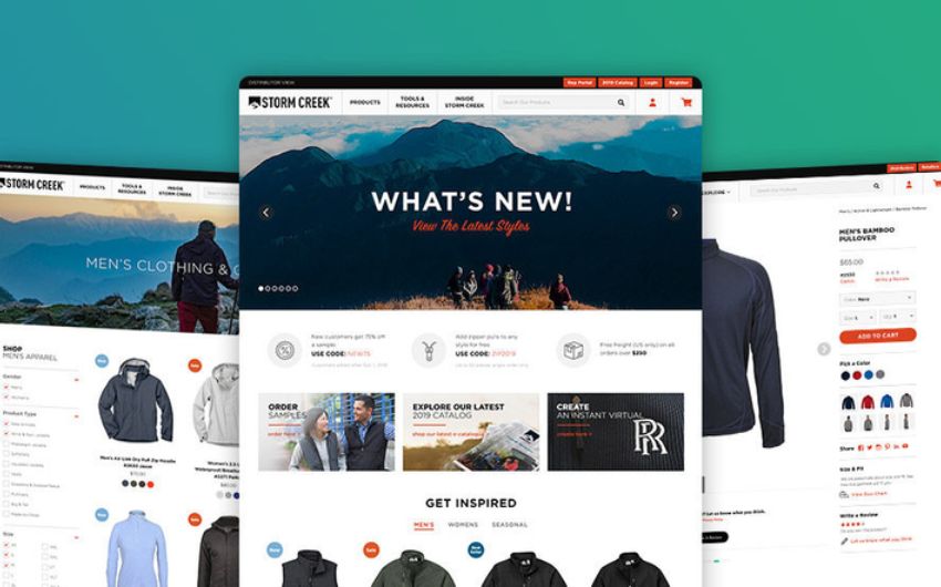
The Mountain offers all the great design features that an ecommerce site should. A clear navigation bar featuring main categories to explore. The service banner placed under the header will let customers know about shipping terms and potential delays. This is a good way for you to manage their expectations.
Ensure that you stay up to date on all the latest e-commerce stats and trends this 2023. If your online business is not ranked highly in Google, Facebook, and YouTube, it’s going to be hard for your customers to find you.
Related Articles
-
 Dallas Ecommerce Retail Summit Oct 2022 – Why You Should Attend?
Maintaining an online shop might be cumbersome if you don’t have any fresh ideas to bring to the table. Experts in the field of digital commerce stress the importance of
-
 Seamless Way To Add Google Analytics 4 (GA4) With Magento 2
Google’s announcement that it would let go of the widely used and beloved Google Analytics Universal Analytics solution shocked the eCommerce industry recently. Normal Universal Analytics properties will stop collecting
-
 Your Shopify Analytics Roadmap to eCommerce Business Growth
Embarking on a successful e-commerce journey requires a well-defined Shopify Analytics Roadmap. In this guide, we unravel the intricacies of leveraging Shopify analytics for sustainable business growth. Uncover actionable insights,